I chose the following photo for this exercise:
It has a mix of light and shade, including shady areas of white as required. It also has some very fine detail in the weave of the tea cosy and some very dense shade beneath.
My Oly E-3 can run from ISO100 to ISO3200 in 1/3 EV steps giving me 16 photos in all from 1/4 sec at f/7.1 to 1/100 sec at f/7.1. For comparison purposes I will display only a crop of the area around the plug.
First up is ISO 100. No colour noise is visible here. The slight texturing of the surface of the plug is just visible, and there is just discernible graininess on the wall socket in the shadow, but not on the white label.
The ‘kite’ mark on the plug is also clearly visible
Bearing in mind that at this magnification a print would be nearly a metre across this is a perfectly acceptable result.
At the opposite extreme here is the shot at ISO3200.
Clearly this is extremely noisy – with very pronounced coloured grain – chroma noise. It is sufficient to hide the kite mark detail on the plug and start to interfere with the edge detail where the socket meets the wall.
The full sized image shows reduced contrast relative to the ISO100 image and some structure to the colour noise in the shadow area to the right of the toaster.
I would use this setting only if I had no other way of getting an interesting or important shot.
If anything, this image at ISO 200 is better quality than the ISO 100 image in that the kite mark is more clearly defined and the shadow areas very appear slightly cleaner.
This may be a function of the slightly shorter exposure time.
Again I would consider this perfectly acceptable.
Back to the other end of the scale – this time ISO1600. Clearly there is still significant visible noise in this image at this magnification. However when the full image image was viewed on screen this is not visible – suggesting that if an image was only intended for web use ISO 1600 would be usable.
However, my experience submitting to photo libraries makes it clear that this would not be acceptable for their purposes.
I also experimented with the noise reduction settings in Lightroom and most of this noise can be removed without dramatic impact on overall image quality. this suggests that in some circumstances use of ISO1600 to ‘get the shot’ would not be unreasonable – although it would depend to a certain degree on the final presentation – e.g. use in a newspaper or on the web.
Continuing my tactic of going from end to end, this time ISO400.
This is slightly more noisy than the ISO 200 image, and for the first time it is possible to discern (just) some noise in the shadow area to the right of the socket. there is also a hint of blue-ish noise (on my screen) in the black of the plug
Viewed at 50% on screen this is certainly acceptable and I would expect it to make a reasonable print at normal sizes. It is probably at the limit of what I would submit to a stock agency.
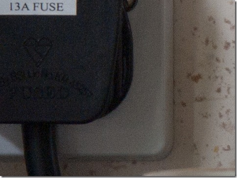
And so to the middle of the scale - ISO800
There is clearly fine grained noise visible against the socket and the tiles and the black of the plug is becoming slightly blotchy. I printed this image at 6”x4” and it makes a print that would be acceptable for general use such as a holiday or party photo but I would prefer a lower ISO for higher quality use.
As with ISO 1600 it possible to make the image useable for other purposes with careful application of noise reduction.
At this point I can conclude that it would be safe to use up to ISO800 in normal circumstances, with a preference for ISO400 or less, and for critical uses such as submission to a stocks agency no more than ISO200. As I have the facility I have also looked at the 1/3 ISO points between 800 and 1600.
This shot at ISO1250 is scarcely an improvement on ISO1600
On the other hand this shot at ISO1000 is only slightly worse than ISO 800. In practical terms it does not alter my overall conclusion.
Conclusion
To sum up then – for critical use I would not exceed ISO 200, although ISO 400 might be acceptable. For everyday use ISO800-1000 would provide adequate results, particularly with careful use of noise reduction, and in some circumstances ISO1600 would be useable if a tripod or alternative lighting to allow a lower film speed were not available.
As my camera has an auto ISO function which allows you to limit the upper end of the range I have set it to ISO800.
Saturday, 29 May 2010
Sunday, 23 May 2010
DPP Exercise 6: Part (ii) : Highlight Recovery
For this part of the exercise I moved from Olympus Studio to Lightroom, as Studio has no highlight recovery slider.
On off-shoot of this was that the tiny amount of clipping visible in the third image (the correct exposure) was no longer recorded as clipping.
The fourth image still showed significant clipping, which was removed by moving the Recovery slider to 18. Although the clipping was removed the level of detail was slightly lower than in the 3rd exposure – although sufficient to make a convincing photo. No image improvement noted at higher levels. In fact above about 75-80 the flat areas facing the camera started to become a rather flat grey.
In the 5th exposure the clipping was only removed by setting Recovery to 100 and Exposure to –1.7. this resulted in an image with a very dark sky, and ugly grey panels on the lighthouse. Also – very little detail was recovered from the highlights – the effect was simply to move pure white to a very pale grey.
Clearly, if the overexposure is not too great it is possible to recover detail from a RAW image, but beyond a certain exposure it is lost forever.
The overall result of this part of the exercise was to make the fourth image, which had a slighter lighter sky than the ‘correct exposure’ the best of the bunch. here is the highlight recovered version:
Labels:
DPPExercise06,
dynamic range,
highlight clipping,
tone
Digital Photographic Practice: Exercise 6: Highlight Clipping
For this exercise I chose this lighthouse on the foreshore at Silloth in Cumbria. It was taken in bright sunlight, and with a polarising filter on the lens to increase the contrast between the sky and the subject.
The first shot, above, at 1/800s, f8, ISO100 is clearly underexposed. It could perhaps be rescued in post processing, but as exercise 5 showed this would be at the expense of an increase in noise, which experience suggests would be particularly visible in the large areas of featureless sky. The highlight areas – for example at the top of the ladder – show a lot of detail at 100%.
This second shot, at 1/400 sec is certainly more usable than the first, but is still rather dark. The brightest parts (the left rear leg for example) have a dark edge which separates them from the blue of the sky – not sure if this is a feature of the lens or of the processing.
The third shot at 1/200 show a very small amount of highlight clipping – less than a few pixels in area on the computer – although somewhat greater on the camera. This is confirmed by the histogram, which scarcely touches the right-hand end. At 100% there is still visible detail in the highlight areas, and the dark fringe between the white and the sky is much reduced. This is, for want of a better term, the ‘correct’ exposure for the white structure, although it leaves the sky a little dark for my personal tastes. Less polarisation would have achieved this.
This 4th shot at 1/100 sec show significant clipping on the sunny side of the structure. There is vey clear colour fringing where the brightest areas meet the darker areas as in this example where it visible between the black and white painted areas, and the white paint and the sky.
Also, at 100% the darkness of the black areas is beginning to give way to a grey, which I find less effective. Unfortunately for this exercise there are no specular highlights in this shot so I cannot examine the way these interact with the surrounding areas. I will try to post some additional shots later to examine this aspect of highlight clipping.
The final shot in this series shows extensive burning out on the white structure to the point where it is difficult to distinguish between the rails and the structure itself at the top. In part this appears to be caused by the white area ‘spilling over’ some of the fine detail. The sky is also desaturating – losing some of its blueness – an effect which appears slightly stronger close to the burned out areas. I am sure this would have been significantly stronger without the polarising filter.
It is noticeable however, that in this picture the area of the photo around the small building at the end of the green is considerably more open and detailed in this picture than in some of the earlier ones.
Conclusion
The clear conclusion from this and the previous exercise is that if there is a clear pay-off between highlights and shadows. If you want lots of shadow detail, you risk burning out/losing detail in the highlights. If on the other hand you retain detail in the highlights you will often end up with very dark shadows. You can try lifting these in post processing, but you will only be able to achieve that at the expense of additional noise in those areas of the photo.
The range between acceptably noisy shadows and acceptably detailed highlights is the ‘dynamic range’ of the sensor and I note that there are number of exercises on this issue later in the course.
NB: The images are marked 2011 but were taken in May 2010 – I have recently uploaded them to Flickr to deal with a hosting issue.
Labels:
DPPExercise06,
highlight clipping,
tone
Saturday, 22 May 2010
Digital Photographic Practice: Exercise 5: Sensor Linear Capture
I chose this image of Reykjavik for this exercise as it had a fairly full range if tones and a number of flat neutral areas – although with hindsight it would probably be better to have an image with more dark tones.
The ‘linear’ version of this loses virtually all detail in the relatively dark foreground as predicted by the exercise text. Interestingly, but not directly relevant to this exercise, there was a slight colour shift on screen as I converted it using ‘save for web’ in Elements.
As I have a relatively old version of Elements I re-corrected the TIFF image in Lightroom to give this very slightly lighter version of the original. I struggled to get any closer to the original but inspection of the image confirms the exercise – there is extra noise generated by this process.
Here are clips of the base of the church tower before (RHS) and after (LHS) processing. In spite of the limitations of the jpeg compression there is an increase in noise visible. At this scale and compression it manifests itself as a smoother look to the concrete in the LH image – there is also less detail visible in the tree. These effects are much more noticeable magnified in an image editing package.
The implication of this for image quality are clear. If we need to brighten the shadows significantly for underexposure the cost is an increase in visible noise, and a degradation of image quality.
Labels:
DPPExercise05,
noise,
sensor,
tone
Tuesday, 18 May 2010
First Assignment Submitted
Yay! Submitted my first assignment today. Came to the conclusion that I had to stop fiddling with the text and actually submit it – I’m guessing this is a fairly commonplace experience. I’d be interested in the psychology because I found it really easy to choose the final selection in the exercises and really difficult in the assignment.
Have decided not to upload the text until I’ve received my tutors comments, but if anyone is interested I’ve uploaded the results of the shoot to my portfolio on the OCA website – here.
The theme I set myself was to produce a photo-essay on Georgian Cockermouth, which could be used on a tourist website, at an exhibition or in a County or Tourism magazine. I wasn’t helped by the weather, but think I managed to catch the atmosphere of the place reasonably well.
Labels:
DPPAssignment 1
Sunday, 9 May 2010
DPP: Digital workflow.
In my write-ups for Ex1&2 I made little or no reference to the workflow after the images had been captured and transferred to a computer. It is clear that some post processing was required to prepare the images for the web so I am discussing this issue as a separate post.
My general practise
In broad terms my standard practise has been to carry out overall exposure, white balance and contrast adjustments in my RAW package, convert the image to the highest quality jpeg and then carry out any cloning, local contrast enhancements, straightening, cropping etc in Photoshop Elements (or Picasa if only simple changes are required). I would then follow this by noise reduction, resizing and sharpening as required.
From reading around (photo magazines, web browsing etc) over the years I have been doing digital photography I am aware of the potential quality issues associated with moving straight from RAW to jpeg and doing further editing on the jpeg. However in practise, as I generally print small or use photos for the web or computer display only, this has not caused problems to date.
Perhaps a more relevant issue for me personally is that I have a tendency to ‘fiddle’ – visiting and re-visiting the image. Given this a more structured workflow at all stages should make my time at the computer considerably more productive and hopefully improve the technical quality of my shots.
One of the stated aims of this course is to develop “… understanding of the standards expected in commercial and fine art photography and the need to establish an effective digital workflow to achieve such standards.” With this in mind I have done some more structured reading around the subject and devised a processing workflow for use in the first assignment and onwards.
RAW development software
There is a workflow implicit in the RAW development software. E.g. the development modules of Olympus Studio are listed in the following order:
Basic 1: Exposure comp; White Balance; Resize; Crop
Basic 2: a range of other global settings such as contrast, saturation, noise reduction, sharpening
Curves:
Corrections: for vignetting, lens distortions, chromatic aberrations and unsharp masking
This is fairly consistent with the model I have adopted over time, although it does not include cloning/healing options, there is no opportunity for levelling or adjusting perspective issues – and in this particular application the unsharp masking is somewhat slow to use so I would normally carry out this step in Elements. In addition the noise reduction facility is very simple – I have generally preferred the results from a stand-alone package.
Towards a more effective workflow
A quick search on Google provides hundreds of pages of information on workflow, of varying depth and usefulness. I chose just 5 to compare with and develop my current practise (see references below).
There are a number of points on which they all agree:
Final digital workflow
References
My general practise
In broad terms my standard practise has been to carry out overall exposure, white balance and contrast adjustments in my RAW package, convert the image to the highest quality jpeg and then carry out any cloning, local contrast enhancements, straightening, cropping etc in Photoshop Elements (or Picasa if only simple changes are required). I would then follow this by noise reduction, resizing and sharpening as required.
From reading around (photo magazines, web browsing etc) over the years I have been doing digital photography I am aware of the potential quality issues associated with moving straight from RAW to jpeg and doing further editing on the jpeg. However in practise, as I generally print small or use photos for the web or computer display only, this has not caused problems to date.
Perhaps a more relevant issue for me personally is that I have a tendency to ‘fiddle’ – visiting and re-visiting the image. Given this a more structured workflow at all stages should make my time at the computer considerably more productive and hopefully improve the technical quality of my shots.
One of the stated aims of this course is to develop “… understanding of the standards expected in commercial and fine art photography and the need to establish an effective digital workflow to achieve such standards.” With this in mind I have done some more structured reading around the subject and devised a processing workflow for use in the first assignment and onwards.
RAW development software
There is a workflow implicit in the RAW development software. E.g. the development modules of Olympus Studio are listed in the following order:
Basic 1: Exposure comp; White Balance; Resize; Crop
Basic 2: a range of other global settings such as contrast, saturation, noise reduction, sharpening
Curves:
Corrections: for vignetting, lens distortions, chromatic aberrations and unsharp masking
This is fairly consistent with the model I have adopted over time, although it does not include cloning/healing options, there is no opportunity for levelling or adjusting perspective issues – and in this particular application the unsharp masking is somewhat slow to use so I would normally carry out this step in Elements. In addition the noise reduction facility is very simple – I have generally preferred the results from a stand-alone package.
Towards a more effective workflow
A quick search on Google provides hundreds of pages of information on workflow, of varying depth and usefulness. I chose just 5 to compare with and develop my current practise (see references below).
There are a number of points on which they all agree:
- Crop in the RAW software – there is little point in working on an image if the final crop is not aesthetically pleasing
- White balance, exposure, highlight and shadow recovery, vignette recovery in RAW software – presumably because these functions are better applied using the data as delivered by the sensor rather than after processing to jpeg or TIFF
- Convert to TIFF for further processing to avoid repeated data loss in jpeg compression.
- Retouching after conversion including local contrast adjustment (burning and dodging), cloning/healing, colour adjusts, saturation, levels etc. These can be completed on layers for easier changes if required
- Resize and sharpen for end use as a final step.
Final digital workflow
- Import – changing final name to reflect shoot and adding general keywords and copyright info as a batch process
- Edit – as per Ex 4
- In RAW software – adjust white balance of final selects, exposure, contrast/curves and cropping.
- Save as TIFFs – batch process to save time – and back up
- On TIFF – noise reduction and resave as TIFF
- On TIFF file – rotation, local contrast adjusts, retouching etc.
- Resize and sharpen for end use
- Save as jpeg and back-up
- Upload/print as required
References
- http://www.picturecorrect.com/tips/develop-an-efficient-photography-workflow/
- http://photo.net/learn/digital-photography-workflow/overview/fine-art-photography/
- http://www.luminous-landscape.com/techniques/process.shtml
- http://www.dphotojournal.com/photoshop-tutorial-seven-essential-steps-to-digital-workflow/
- http://digital-photography-school.com/
- http://www.oreillynet.com/pub/a/javascript/2003/12/17/digital_photography.html
Labels:
DPPExercise01,
DPPExercise02,
workflow
Sunday, 2 May 2010
Book Review: The Photograph as Contemporary Art – Charlotte Cotton
I feel completely unqualified to review this book in any meaningful way being, as it is, the first photography book I’ve read that isn’t about equipment or technique.
It is a quick canter through the recent history and current state of art photography. It does not attempt to define what art photography is – although it may be implicit in the text.
With hindsight I suspect I should have read the Liz Wells book, Photography - A Critical Introduction, before tackling this one. My first difficulty is the language. I now understand how someone non-technical might feel on reading some of the more technical articles I’ve written during my time in the nuclear industry.
To make matters more difficult many of the concepts are equally unfamiliar territory for someone whose photographic experience is dominated by photographic magazines and stock photography.
That said – I couldn’t help wondering sometimes if the emperor was really wearing any clothes. I’m not sure I understand why the work of some of our more famous landscape photographers or some of the outstanding product and advertising photography that can be seen all around us are not included as ‘art’, while some frankly ordinary shots – no matter how carefully conceived – apparently deserve that exulted title.
Perhaps the mistake is mine in reading the non-inclusion of some of the former as a criticism, when in reality it’s simply a categorisation.
Categorisation does seem to be one of the major purposes of the book – dividing modern art photography into eight themes. Some of these are easy to understand e.g. photographs which are simply the medium for portraying other art, tableaux photography and dead-pan photography. Others were more troubling – for example the re-presentation of others photos or concepts made the emperor look particularly poorly dressed – and that in spite of the fact the the analysis was fairly clear. I understood the concepts – I just struggled to accept them.
So – all in all – quite a challenging first pick from the list of recommended texts on the OCA website, but one I think I’ll be coming back to fairly frequently as I develop my broader understanding of the medium.
Next up – Liz Wells.
Labels:
book review
Saturday, 1 May 2010
Digital Photographic Practise: Exercise 4: Editing
Perhaps a more appropriate name for this exercise might be 'formal editing' or 'structured editing' as anyone who has taken more than a couple of photographs is already editing when they choose their favourite.
I mention this because the project I chose for this exercise was the same project used in Exercise 1 - a portrait shoot with my daughter -and she had chosen her favourite and made it into her Facebook avatar within minutes of my uploading the shots to the computer.
The edit
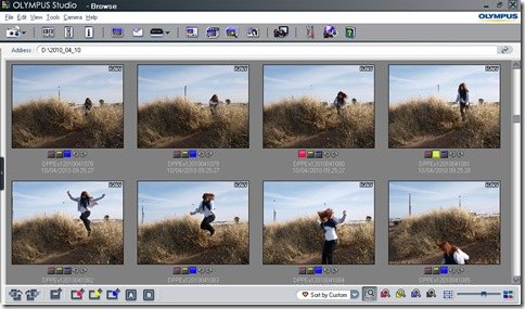
The shoot from Exercise 1 produced 166 shots. This relatively high number of shots came from several sequences shot at quite high frame rates. These provided a challenge at some stages of editing when there were sequences with relatively similar images. The photos were sorted using Olympus Studio which allows tagging with blue, yellow and red tabs which can be seen in the opening edit screen below.
Technical edit: This was done with the pictures viewed sequentially and as large as the screen would allow. Rejects were marked with the blue tag.
The criteria I adopted included both technical faults, e.g. over or underexposure of the subject, and clear issues with the pose or background, e.g. closed eyes, strange facial expressions and obviously intrusive background subjects. The challenge I found here was that there were a few shots which were technically flawed but showed potential for rescue in post-processing. I kept these in for good measure.
Conversely a couple of the sequences (such as the one shown here) were of actions such as jumping or throwing stones into the sea.
Some shots in these sequences were technically adequate but were so clearly inferior to other shots in the same sequence that it seemed pointless retaining them to throw out at the next stage. In the example above those with the blue tag were removed at this technical edit stage.
At the end of the technical edit there were 110 shots remaining.
The selects: For this edit the key criteria were more artistic – facial expression, pose, placement of shadows, overall composition (particularly in the action shots) and quality of background. Again a couple of technically challenged photos were retained, in case on reflection they would be amenable to a high-key treatment. It was at this stage that I cursed my decision to let my daughter wear her favourite hoodie - which was largely white and quite challenging to expose correctly in the bright sunlight. After this stage there were 53 shots remaining.
The first selects: Aware that the final triage in the exercise required the choice of just 2 shots, I set myself a personal target to have no more than a dozen first selects. Key issues at this stage were how well the photos worked together as a set – were there a range of poses, locations and expressions – and selection hinged on relatively small personal preferences. I found it helpful to set up the browser so that I could see two shots together when required.
Another factor to consider at this stage was possible post-processing options. For example I kept a photo with large and clearly blown highlights on the basis that the smile was worth retaining. I managed the issue in processing by cropping and the addition of a simple vignette and liked the result sufficiently that it became one of my 2 final choices.
My final dozen, with brief reasons for selection are here:
Sets the scene, and I like the rather conspiratorial pose and expression
More serious pose, background colour sets off hair colour nicely
Grin, and I wanted an edge of the water shot. Offshore structure provides a balance to the composition
I wanted a stone-throwing shot, and this was the best of the two series. Shadows were too heavy in some of the others or the back leg was cut off. Also I like the way the pose and the stone lead your eye from the shot on the same trajectory.
I wanted a full face shot as part of the final set. There were two acceptable shots at the end of this series – either would have made the first selects on the basis of the pose as they are essentially a repeat. I simply chose the last of the series for convenience
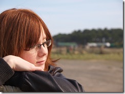
I wanted a close in profile and this was the shot in which my daughter relaxed most.
I took 3 shots at this location – the other two were in landscape format – this was a more effective composition.
The bounce of the hair means this shot was the stand-out from this particular series. It adds an extra sense of fun to the overall set.
Technically the best of the shots from this series and I wanted something to counterbalance the ‘fun’ elements of the series.
This was my daughters choice of location so I wanted to include one of the series. This had the best expression and I also liked the highlights on the back of her hair.
Final choices
This is the one my daughter chose for Facebook, but even without that pressure it is still one of my two favourites. The 'pose' catches the fun we were having at the time – and perhaps even the simple joy of being at the beach on a sunny day. There is sufficient light on her face to see her smile, and the photo is full of animation.
And this is the one that required the post-processing to manage the overexposure in the hoodie. It captures my daughter at her most relaxed. There is colour and a nice catchlight in her eyes which are nicely in focus and there is quite a nice contrast between the colour of her scarf and her hair.
Her more reflective side is dealt with elsewhere in the final selects but these two capture her character well, and meet with her approval – which is also important.
Conclusions
This is the first time I have used the tagging function, and building a structured edit around it certainly made it easier to choose the first selects. It is also quite likely that without the thought processes of going from stage to stage that I would have rejected the 2nd of my final choices, and so lost a satisfying photo.
Labels:
DPPExercise04,
portrait,
workflow
Subscribe to:
Posts (Atom)