Monday, 18 October 2010

DPP1: Exercise 23 : Subtraction

By happy coincidence I find I’ve completed the technical requirement for this exercise in response to my tutors comments on my first assignment.
This is the photo I submitted to the assignment:

My tutors comment was that he would have preferred to see more of the woman on the right, but perhaps I should clone her out altogether to leave a character portrait of the man – which is what I did:

I also took the opportunity to clone out the doorbell to reduce the ‘modernity’ of the picture. Interestingly the door was quite difficult to do convincingly. It would have been easy to produce a featureless layer of black – but that’s what it looked like – on the other hand – I had relatively little information to work with on the door details so I added in what I feel is enough to give a convincing result without risking obvious re-use of picture elements.
Ethical issues
I am clear in my own mind that manipulating a photo in this way is not un-ethical providing the intent is not to deceive. In this case it is done to produce a better portrait of the man in period dress – and for no other reason.
Clearly the editor of the Toledo Blade did not share my view in these examples
As a counter example – it is clearly un-ethical to remove people who subsequently become political opponents from photos as in these examples – although, given that these are pre-digital you have to admire the skill of the air-brushers.

Sunday, 17 October 2010

SnapIt: A handy little utility I’ve just discovered and wanted to share

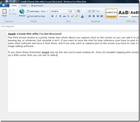
The Print Screen button is a pretty handy item which allows you capture what on the screen so you can add it to your learning log, or whatever, but versatile it isn’t. If you want to save the shot for later reference your have to paste it into some other software and save it from there, and if you only want to capture part of the screen you have to crop it with image editing software.
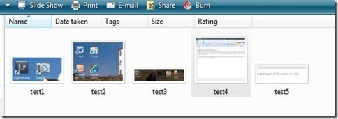
If you share these frustration SnapIt may be the tool you’ve been looking for. Once it’s installed you have to run the program in the usual way with a double click, which puts a little icon in the system tray.  A little niggle – but a ‘run from start-up’ option would be nice. Once it’s up and running tapping ‘print screen’ brings up a little cursor that you can use to select either the whole screen, like this:
test4
or just a part of the screen, like this:
test5
You can paste the result into other major software (Word. PSE etc) in the usual way  although, oddly, this doesn't work with LiveWriter2011 or Mail . Unlike Print Screen though, you can right click the tray icon and save as jpeg,gif, tif, png or bmp for later use. Better still, you can customise SnapIt to automatically save these snippets in a folder of your choosing as you go using a prefix with an incremental number in it so that the files are named Prefix1, Prefix2, etc, etc. Like this , in fact: test6

To my mind this little benefit more than outweighs the fact that the paste is not compatible with everything. The files appear to be saved at the native resolution of your screen –  it’ll produce a life size image when you next use it unless you choose to reduce it or enlarge it yourself.
And that’s it really – the web is full of little utilities that you download and never use, but for a shade over £10 I think this is worth the money. Obviously you could achieve the same effect by pasting into an image editor, but this is much quicker and simpler.

Pro's
  • Makes Print Screen a much more useful tool
  • small download (a couple of megs)
  • the automatic save routing is a real plus
Cons
  • You have to start it each time you turn the computer on – it would be nice if it had a ‘run at start-up’ option.
  • the paste option doesn't appear to work with WindowsLive type programs

I can see it having quite a lot of uses in my learning logs capturing what I did to achieve a particular effect in post-processing, and I suspect it has a lot wider uses in blogging, writing, producing manuals – on fact anywhere you might want to show or archive what you see on the screen. If you’re interested you can download a trial version from Digeus Software

Friday, 15 October 2010

Digital Photographic Practice 1: Exercise 22: Addition

Several false starts at this exercise…not least because the weather has not co-operated with the requirements of the photo to be taken. In the end I decided to move on with some shots taken from my archive. In this respect I’m lucky that I have, in the past, taken shots with the deliberate intent of being able to combine them later if I wanted to.
On the downside, I have seldom taken these with a tripod (usually because of limits on luggage), relying instead on other less stable methods of keeping the shots properly aligned. The exercise also emphasised the need for care in the subjects that you use with these particular techniques
My first attempt – and one of the false starts referred to above -  used these two shots of a wooden barn in Switzerland.

The two shots were taken at 17mm; f/11; 1/200 and 1/50 respectively and they are sufficiently close in alignment to allow an accurate overlay by making use of a small ‘nudge’ on the top layer. Unfortunately there is a small amount of motion blur in some of the vegetation in the lighter version which means we can never obtain a really high-quality print. However, for the exploration in this exercise the movement is not the issue.
Using the Eraser Tool 1
In this version I have used the eraser tool, but rather than go for a total erase I have reduced the opacity to 10% and worked over the sky area several times with a relatively large soft edged eraser– bringer more detail back in to the blown out areas of sky and blending them down to the darker areas.

As the student notes observe, this does not give fine control of the area affected. On the other hand it does provide very good control over the level of improvement/replacement making it easy to obtain a natural looking result. So far, so good. Unfortunately by contrast the ‘select and delete’ method suffers from a number of problems.
Select and Delete 1
I could only obtain poor results with this technique.
  • The new sky is much too dark and un-natural looking and cannot be selectively improved using this technique (although others could be employed)
  • The soft edge of the clouds where they fall over the hills is difficult to select and feather to make a convincing blend
  • Although selection is more accurate that a simple eraser the individual spaces between the leaves of the small tree in the foreground are difficult and very time consuming to select and result in an un-natural appearance.
Both of these latter problems are identified in the student notes and this first attempt confirms the predicted difficulties - although as noted above the eraser method handles them reasonably well.
2nd Attempt
Most of these difficulties are down to the choice of subject/image – so I repeated the exercise with an image with a much simpler skyline. The relatively smooth contours and lack of fine skyline detail in this image make selection much simpler.

The two exposures are (EXPOSURES) respectively.
Eraser Tool 2
Again using a large soft-edged eraser it is relatively straightforward to restore detail to the sky in a relatively natural way. I have not restored all the detail in the brightest areas  as I felt this was more consistent with a contre-jour shot such as this. Note that I used the same technique to reduce the specular highlights on the water and add detail to the waterfall as well.
 
Select and Delete 2
The select and delete shot is also an attractive option. It was certainly more difficult to obtain a natural looking blend between the new sky and the original landscape but I am reasonably happy with this outcome. Note that I used the eraser brush technique to improve the waterfall and river, as previously – use of the delete technique is not effective here because of the exposure difference.

Adding a new sky
The image I chose for this also has a relatively simple skyline, but I ran in to the issue explored in the previous exercise – that is, I had to use personal judgement to some degree to select the skyline as the boundary between the snow field and the cloud was not always clear cut. The replacement sky was taken from an image which had sunlight from roughly the same direction.

The end result is considerably more attractive than the original. I slightly increased the lightness of the blue sky by moving the white point down to 194 in levels, and also slightly reduced the ‘blueness’ using the colour variations tool to achieve a more natural effect.

Conclusions
First the practical ones:
  • The select and delete method is simple and effective but requires quite a bit more time to complete, and offers considerably less control over the final product when simply replacing one exposure with another.
  • Either technique works more easily with less detailed skylines. Pictures where the cloud impinges on the landscape are best managed with the eraser tool technique.
  • When replacing a sky, care is needed to obtain a reasonably natural looking edge as the opportunities for blending are much reduced.
And finally the ethics:
  • I see no issue with simply using these techniques to compensate for the dynamic range limitations of the sensor as in the first two examples.
  • Some may feel that replacing a sky with a completely different one is ‘cheating’ – the scene never looked like that. Be that as it may the final version is much closer to my memory of that visit – and as this is a holiday photo for my own purposes there is no issue.
  • For other uses I believe the general conclusions of my recent post still hold – provide there is no intent to deceive use of this technique is fine. For example – a website for Icelandic holidays could reasonably use this photo to illustrate the location, because days with bright blue skies do – regularly – occur here. In such a circumstance this is simply a way of overcoming the practical difficulties of reaching a relatively remote location at exactly the right time.
  • On the other hand – when used to mislead – for example by adding a backdrop of distant mountains to the brochure photo of a hotel there are clearly some ethical issues to be addressed. As a working press officer I have been subjected to this treatment of our plants on a number of occasions – all of which resulted in phone-calls to the editor or picture desk.

Thursday, 14 October 2010

Monkey's Wedding? | We are OCA#comment-2033

Just blogging this so that I have it captured for future reference. I particularly like the way the artist explains why it wouldn’t be right for him to ascribe a specific meaning to the piece, and the comment on Venn diagrams
Monkey's Wedding? | We are OCA#comment-2033

Thursday, 7 October 2010

Photomanipulation and Ethics

For reasons that are not entirely clear to me, photomanipulation seems to have become more important as an issue since the advent of digital cameras. It may be as a result of perceptions that it is relatively easy to fake photographs digitally, or it may simply be a function of the relative ease that the internet has brought to the spreading of such concerns. Whatever the cause it is a rich subject for both research and discussion, and as module 4 of DPP1 covers the issue in some detail it seemed worthwhile to add a few thoughts on the issue to this blog.

One of the more common conceptions of photography – particularly in its early days - is that a photograph somehow portrays something that is real or, perhaps more accurately, true. Photos are certainly seen as more real than paintings to the point where early pictorial photographers sought to make their photos look like paintings in order to have them seen as art. Even Barthes considers that one of the essences of photography is that it represents ‘what-has-been’ (although he neatly sidesteps issues of manipulation by writing them off as trickery).

But this has never been a true conception – for a start, and at the most trivial level, a photo is a 2-D representation of something that is 3-D in real life. In choosing an angle and lighting the photographer is already imposing their view of the subject on the viewer. Even at the level of something as automated as a passport photo, the authorities stipulate poses and lighting requirements which remove some aspects of individual character to give a more neutral reading of the subject. This appears to have been realised early in the history of photography assuming this quote is accurately reproduced:
In 1903 Edward Steichen said . . .
In the very beginning, when the operator controls and regulates his time of exposure, when in the dark room the developer is mixed for detail, breath, flatness or contrast, faking has been resorted to. In fact every photograph is a fake from start to finish, a purely impersonal, unmanipulated photograph being practically impossible. When all is said, it still remains entirely a matter of degree and ability. Adobe Magazine 6(3), 104)

What chance then that even an intelligent and thoughtful photographer can really take a totally objective photo of their subject – even assuming we understand what objective means.

Some people have suggested a hierarchy of acceptable behaviour, (Reference)and this also appears implicit in the teaching materials of the course. Typically this concentrates on manipulation after capture, but this article draws attention to a number of ways in which photos can be manipulated prior to photography, including setting something up for effect. Some particularly crass examples of this can be found here (although it seems wise to be careful when citing websites with a name like zombietime). In spite of this it seems to me that most would regard changes in front of the lens as acceptable provided they were not deliberately misleading, but it is worth noting even here, choice of subject lighting location etc can have an impact on the meaning of the photo as Sontag notes in ‘On Photography’.

At the next level of change are simple adjustments that could easily be made in a darkroom, or with a minimum of post-processing skills. Dodging and burning, global contrast adjustments, corrections of colour casts, sharpening, removing dust spots – they can all be used to change the emphasis of a photograph, and so change its meaning. The course material separates these into two categories – Improving and Enhancing
Most photographers would accept changes that compensate for the technical limitations of the camera as legitimate-some referring to them as ‘technical - and even important international photo competitions accept this level of manipulation.

For certain fields of scientific or forensic photography the ground shifts very easily at this point and great care is needed. At what point does simple cropping become removal of an element – and if it is acceptable to remove dust spots, what problem can there be with removing a small black dot produced by a bird on the skyline which disturbs the composition? Both are in the digital negative, after all. But what if that small black spot is a tell-tale piece of evidence in a forensic photo?

At this stage in the hierarchy we are at enhancing. Some would argue strongly that this is inappropriate for photojournalism, and while it may be appropriate in forensic photography to clarify the image elements, great care would be needed to ensure that the final result was an image element and not an artefact of the enhancement.

On the other hand enhancing is clearly a stock in trade for advertising and fashion photographers. If a model has been chosen for his/her radiant smile and the shoot is for a toothpaste manufacturer, is anyone really damaged if their teeth are whitened slightly for effect or the unfortunate boil on the nose of the model is removed in Photoshop?

Even here there is ambiguity, because it would be possible to argue that the whitening, which is generally considered less obtrusive, is more deceitful than the removal of an element of the photo which has little to do with the end use.

This leads us neatly to the next up in the hierarchy of unacceptability -subtraction of photo-elements. This is widely regarded as unacceptable in photojournalism. Maintaining this stance lead to severe consequences for at least one photojournalist although the alterations appear to me eyes, to have little or no consequence to the meaning of the photo. The addition of photo-elements is admittedly more tricky than subtraction of minor elements from the photo that resulted in his suspension, but it the latter that initially got him in to trouble.

The contradiction in this stance is that removal of an element before the shutter is pressed would probably be regarded as acceptable – for example removing an item of litter in a woodland scene. In this example it is clear that the litter is not a natural part of the scene so it is difficult to object, but where does that leave the gentle ‘gardening’ adopted by some plant photographers, removing natural elements such as stray leaves and grass – sometimes permanently with a pair of scissors. This appears to be acceptable to all but absolute purists, whereas removal of the same item in Photoshop would lead to disqualification from some competitions.

Another, and recent example, of the contradictions of this stance is the case of the journalist recording street fighting in. He was eventually disqualified for removing a small piece of irrelevant detail from the photo, when to my mind the greater offence was the fact that the cropping and other traditional darkroom-type ‘improvements’ have significantly altered the visual clues about what is happening to make it seem considerably more sinister and furtive. In other words the meaning has been changed. This appears to have been regarded as acceptable by the judges.

At the top of the hierarchy of unacceptability is addition of photo-elements or photomerging of different elements to produce a different end result.

There are many historical examples of this from pre-digital times showing why this practise is considered unacceptable in photojournalism including a famous picture of Abraham Lincoln and lots of socialist dictators who have had ex-comrades removed from the records. Perhaps the most widely publicised recent example was the tampering of an image of a bombed village in the Lebanon. A journalists stock in trade is their credibility so it is easy to see why this is an ethical issue in their field.

And yet these techniques are the bread-and-butter of advertising and art photography. In the case of the former some attempted deceit is commonplace and a vital part of the creativity of some advertising
A recent billboard advertisement for Bristol Zoo featured a ‘flion’ - a relatively obvious photomerge of a vulture and a lion. I fail to see how this can be considered unethical. It is clearly a manipulation and essentially a visual pun.

Perhaps a more grey area is the use of photography for cosmetics sales, where retouching can easily exaggerate the effects of a particular beauty treatment, and thinning of models is considered by some to contribute to slimming disorders in younger people. But exaggerated claims have always been a part of advertising so it seems difficult to single out photography for criticism.

To round up then, where do I sit in the debate? It seems fairly clear that there are types of photography where certain techniques are acceptable (ethical) and other areas where they are less so. Am I concerned that a photojournalist has removed an item from a shot that has no impact on its meaning – no. On the other hand, I would regard it as unethical if a simple pre- or post-exposure change were made to convey something other than a reasonably objective view. The question is: Is there intent to deceive?

The same is true for any other field of photography. If I am selling landscapes for a living, why not remove the telegraph wires? Most people would prefer the picture without in any case. But by the same token, if I were advertising a hotel based on the beautiful view from the window it would be unethical to remove the large pylon in the middle of it.

For advertising photography in general, everyone understands that the role of advertising is to sell products, and such photos are viewed (in the Western world at least) with a degree of scepticism which permits a level of enhancement. If on the other hand a photo were ‘fixed up’ to illustrate a totally fictitious claim, where the audience could have no understanding or knowledge of the fiction then this would be unethical.

In conclusion I believe that photo-manipulation is generally acceptable provided that it does not fall into the category of deceit, taking into account the purpose of the photograph and the intended audience.
Monday, 4 October 2010

Digital Photographic Practice 1: Exercise 21 – Enhancement

Another photo of my daughter for this exercise. She agreed to  the portrait session in return for a copy for her Facebook avatar – which seemed like a fair deal. Anyhow – here is the original. Lighting is natural overcast daylight with a standard umbrella as a backdrop – so totally diffused! Frankly I was delighted with this as it stood – almost seems a shame to play with it. All mods completed in Lightroom 3 – using the adjustment brush for selections.

First up a slight increase in brightness and contrast – it’s quite subtle but I didn’t want to go too far as it looked un-natural.

This certainly draws attention to the face, and the ‘back’ eye appears brighter and attracts attention. I think the slight hotspots at the top of her cheek and above her necklace are slightly distracting.
I interpreted this exercise as asking us to look at each change individually, so the next shot is the original exposure, but with the eyes brightened and extra saturation

Quite a subtle difference I think, but overall I prefer the effect – the skin hotspots are less distracting and the blue of the eyes is quite a powerful draw on the attention.
Next up is again the original exposure, but changing the colour of the eyes – my daughter liked purple, but I preferred this green. I didn’t want to go too intense – this level feels natural to me.

At this stage I thought I would take the exercise to a logical conclusion by adding a couple more tweaks not required by the text. Back to the original exposure and eye colour, but this time I brightened her smile slightly (as if it wasn’t cheerful enough already)

Finally – LR offers a skin glow adjustment which reduces the clarity slider and results in a pronounced softening of the skin. I tried that together with the eye and teeth adjustments. As the overall effect was to brighten the image along the lines of the first adjustment, I also toned down the hotspots to produce the following:

This is a little too plastic for my tastes – perhaps because I’ve overdone the effect - but is far from uncommon as a treatment for females celebs and on the cover pages of magazines. In truth I moved the clarity slider backwards and forwards a dozen times, but could never seem to find the right balance between smoothed and plastic – this version was the best compromise. I suspect that part of the problem is that I’m too familiar with my daughters face!
Conclusions
This was certainly a fun exercise – I feel I am beginning to get to grips properly with the degree of control afforded by Lightroom.  But of course the underlying theme is – is this acceptable?
Personally I see no issue with the versions that have simply lightened or highlighted key features to make the face more attention-grabbing. Nothing has been fundamentally altered as a result. The green eyes could be considered less acceptable as they are altering reality, but it is unlikely the same objection would be raised if the effect had been achieved with coloured contact lenses.
I also struggle to find anything unacceptable about the skin smoothing effect – other than it looking a bit un-natural in this case. Again, good make-up might well achieve a similar (and similarly un-natural) effect and few would object to that approach.
The caveats from previous exercises about photojournalism and forensic photography still apply, but without these techniques I suspect the advertising and fashion businesses would struggle. It is possible to argue that the use of such techniques in these industries is deception and therefore un-ethical, but such industries have always sold an ideal, and in many senses digital enhancement draws on the aspirational imagery of the idealized families and household products which have always been a feature of these industries.
Footnote
A common use of enhancement techniques is to thin down a limb or reduce a waist size. Done clumsily such actions can have unfortunate, but hilarious results, as featured in this website – Photoshop Disasters.

Digital Photographic Practice 1: Exercise 20 – Improvement

The base photo for this exercise is my daughter caught in dappled shade in a woodland, as follows:

While not as extreme as the example in the workbook the lower half of her body is quite well hidden in the shade and the upper half is also broken up by shade patterns.
Before trying the suggested Photoshop (PSE2) techniques I tried improving the shot directly in Lightroom 3 (LR) using the adjustment brush to loosely select all of the shaded areas in the foreground and the whole figure bar her face. I then slightly increased brightness and adjusted the contrast to retain a more natural feel. I also increased the saturation in the selected area a little. By careful use of the feathering control I was able to minimise the need to accurately select the figure. This was especially useful around the trousers where the edge was not always clearly defined.
The end result is here – and is a clear improvement on the original:

My next attempt was using PSE2 – I exported the original as a TIF and selected the figure using the selection brush. I did this by working on a layer which I had brightened to improve visibility of the trousers against the dark background. I then saved the selection, deleted the layer and imported the selection into a new layer.On the first attempt I only selected the figure, and the following is the best I could achieve with the brightness, contrast and levels tools. To my eye this is inferior – with the girl beginning to look a little washed out while her trousers are still lost in the shadow.

As a final comparison I used PSE2 but adopted the same approach as in the LR version – selecting all the shadow area as well as the figure. the result (below) is a significant improvement on the previous attempt, but I felt that overall the selection process was more long-winded than in LR, and the results were still not as good – in particular the hair colour is less saturated and the area visible between the legs of the jeans looks less natural. I’m sure that with further work this could be improved, but this is already a more long-winded process than LR and suffers from the quality disadvantage of not having the RAW data to work with.

Conclusions
Firstly – and not the primary aim of the exercise – it is clear that in spite of the flexibility of Photoshop Elements there are some real advantages to the workflow in Lightroom.
Moving on to the primary aim of the exercise  - I have no doubts that all these adjustments are perfectly legitimate in most cases, for a number of reasons:
  • nothing has been added or taken away from the picture – the content is as it was
  • technically we are not doing anything in these pictures that might not have been achieved to a similar level of success with fill-in flash – and I don’t think anyone suggests that is unethical
  • the end result is probably closer to the visual impression the photographer would have received because of the way the eye works – so we are, once again, compensating for a technical limitation of the equipment.
I said ‘legitimate in most cases’ – so where would such changes not be legitimate? An example of where I consider these techniques to be unacceptable is the recent case of Stepan Rudik in the World Press Awards which discussed in the links attached to my previous blog post – more details here. To my eye in this example the meaning of the photo has been significantly altered by the simple expedient of cropping, dodging and burning. Surely as a photojournalist objectivity is imperative and anything which significantly alters the meaning of a photo is not acceptable? What I find particularly challenging about the example discussed is that the journalist was disqualified for a change which had no significant impact on the photo, while the fact that his dodging and burning had given it a whole new meaning seems to have passed the judges by.

Caught ‘in the black’ | We are OCA

In the spirit of  a Learning Blog,  I thought I should capture my contribution this link, which discusses the ethics of an entry in a recent photography competition.
Caught ‘in the black’ | We are OCA

Friday, 1 October 2010

Saving JPEG Photos Hundreds of Times

Found this in my twitter stream today. It seems relevant to Exercise 11 – The Value of RAW. The link contains a couple of video clips showing the effect of saving a jpeg at high compression several hundred times. Obviously, this is an extreme example, but it is a very graphic demonstration of how, over time, even small loses of data can build up to corrupt an image.
Saving JPEG Photos Hundreds of Times