Found this in my twitter stream today. It seems relevant to Exercise 11 – The Value of RAW. The link contains a couple of video clips showing the effect of saving a jpeg at high compression several hundred times. Obviously, this is an extreme example, but it is a very graphic demonstration of how, over time, even small loses of data can build up to corrupt an image.
Saving JPEG Photos Hundreds of Times
Friday, 1 October 2010

Thursday, 30 September 2010
Digital Photographic Practice 1: Exercise 19 – Correction
The opening part of this exercise concentrates on removing dust shadows – something I have never had to do because of the effectiveness of the sensor-clean system on my camera. To complicate matters the current re-build of the OCA student website means I can’t download the example file. So instead I have gone with this shot from my own collection. The blemishes are in fact defocussed raindrops on the window I was shooting through. From examples elsewhere on the web – here for instance – I’m comfortable that this will pose the same challenges.

I used the Spot Removal Tool in Lightroom 3 to remove the very obvious grey blobs – here it is in action:

In general terms you select a diameter for the tool suitable for the blemish, and click on the centre of the blemish. the system automatically selects a nearby area to cover the blemish. This can be tweaked manually if required. This manual tweaking makes it very similar in behaviour to the clone stamp tool in Elements, although it is slightly less flexible because you can’t ‘paint ‘ with it for a large area correction. The end result is here:
 .
.
Moving now to flare correction – I tend to reject obvious examples of flare – so I have very few in my collection, and again no ability to download a sample from the website. With this in mind a deliberately introduced flare in this photo, taken on holiday in Egypt. Note the peculiar shape and colours of the flare highlight at the bottom of the picture. This is a characteristic of the extreme wide-angle lens I used which has a very large front element which is difficult to shade from the sun – it is clearly visible in the viewfinder , and can normally be avoided at the point of capture. I think it is clear from the outset that selecting this ‘blemish’ and applying a curve adjustment will be ineffective as the colours have covered the detail in the grass.

It is however , simply corrected using the Lightroom Spot removal tool – using several overlapping spots to cover the lower blemish:

Perhaps a less dramatic example is this one – taken a couple of days earlier:

This one was cleaned up using the clone tool in Darken mode, as suggested, although the end results were very similar to use of the Lightroom Spot Tool.

Acceptability of this type of clean-up
I struggle to understand any real objection to this kind of clean-up, except perhaps in forensic or other photography where recording the precise detail of the scene is critical. For example, the corrected pyramid contains some fine detail in a small area of stonework that is different from reality. This has no practical importance unless the photo is specifically for record or analytical purposes. Otherwise the scene is indistinguishable from my memory of the day.
The suggestion that you should deliberately leave your mistake in as a more ‘accurate’ version seems totally illogical. On that basis, should we simply be required to retain all our mistakes? There is an interesting parallel with the use of a spell-checker. Would anyone seriously suggest that in the interests of truth that I should publish this blog with all the spelling mistakes and typos that my banana-fingered typing introduced at the first pass. Of course not, and I can see no reason for doing the same with a photo. The flare/dust spots were introduced by the photographic process, and (subject to the provisos above for the special cases mentioned) it seems perfectly legitimate to remove them.
I used the Spot Removal Tool in Lightroom 3 to remove the very obvious grey blobs – here it is in action:
In general terms you select a diameter for the tool suitable for the blemish, and click on the centre of the blemish. the system automatically selects a nearby area to cover the blemish. This can be tweaked manually if required. This manual tweaking makes it very similar in behaviour to the clone stamp tool in Elements, although it is slightly less flexible because you can’t ‘paint ‘ with it for a large area correction. The end result is here:
.Moving now to flare correction – I tend to reject obvious examples of flare – so I have very few in my collection, and again no ability to download a sample from the website. With this in mind a deliberately introduced flare in this photo, taken on holiday in Egypt. Note the peculiar shape and colours of the flare highlight at the bottom of the picture. This is a characteristic of the extreme wide-angle lens I used which has a very large front element which is difficult to shade from the sun – it is clearly visible in the viewfinder , and can normally be avoided at the point of capture. I think it is clear from the outset that selecting this ‘blemish’ and applying a curve adjustment will be ineffective as the colours have covered the detail in the grass.
It is however , simply corrected using the Lightroom Spot removal tool – using several overlapping spots to cover the lower blemish:
Perhaps a less dramatic example is this one – taken a couple of days earlier:
This one was cleaned up using the clone tool in Darken mode, as suggested, although the end results were very similar to use of the Lightroom Spot Tool.
Acceptability of this type of clean-up
I struggle to understand any real objection to this kind of clean-up, except perhaps in forensic or other photography where recording the precise detail of the scene is critical. For example, the corrected pyramid contains some fine detail in a small area of stonework that is different from reality. This has no practical importance unless the photo is specifically for record or analytical purposes. Otherwise the scene is indistinguishable from my memory of the day.
The suggestion that you should deliberately leave your mistake in as a more ‘accurate’ version seems totally illogical. On that basis, should we simply be required to retain all our mistakes? There is an interesting parallel with the use of a spell-checker. Would anyone seriously suggest that in the interests of truth that I should publish this blog with all the spelling mistakes and typos that my banana-fingered typing introduced at the first pass. Of course not, and I can see no reason for doing the same with a photo. The flare/dust spots were introduced by the photographic process, and (subject to the provisos above for the special cases mentioned) it seems perfectly legitimate to remove them.
Sunday, 19 September 2010
DPP1: Assignment 3: Tone Roses
Well, finally I finsihed my third assignment and have sent it to my tutor. If anyone wishes to have a peek at the photos, or comment, they're on Flickr, here:http://www.flickr.com/photos/npmimages/sets/72157624941682338/
Have not tried serious black and white photography before, and really enjoyed the challenge of this assignment. I'll post my own thoughts on the photos once I've had my tutors feedback, but here's my favourite shot from the set.

Have not tried serious black and white photography before, and really enjoyed the challenge of this assignment. I'll post my own thoughts on the photos once I've had my tutors feedback, but here's my favourite shot from the set.

Wednesday, 1 September 2010
Digital Photographic Practice 1: Exercise 18 – Colours into tones 2
As it says in the notes the aim of this exercise was to use channel adjustments to achieve a specific effect. The 3rd suggested topic in the exercise (a pic of a garden with the greens appearing light in tone) appears relatively simple to achieve so to be perverse I’ve tried the other two.
Emphasising aerial perspective
The challenge here is to emphasise aerial perspective in a landscape. I chose the following image – a desert landscape from the Sinai - as a starting point as it already has a strong sense of aerial perspective. It is a slight crop from the original to remove some rather unsightly road edging from the foreground. The background mountains clearly show the characteristic blue haze which adds to the perspective.

A default conversion, with all the colour channels set to zero looks as follows:

This is rather flat and un-interesting. Although there is some sense of distance, it is perhaps slightly less effective than the colour version, and there is little tonal difference between the foreground, the distant mountains and the sky.
In his book ‘The Photographers Eye’, Michael Freeman suggests that favouring the blue channel during conversion emphasises aerial perspective (Chapter 2), so that was the starting point for the final conversion.
The overall conversion figures are as follows. I lifted the blue channel +75 and the Aqua channel +95, then I reduced the overall brightness of the picture by shifting the curve (-32 lights, –52, dark, –5 shadows) and darkened the sand still further (Orange –14, Yellow +7). Finally I softened the picture very slightly (clarity –6).

Conclusion
This treatment has had the visual effect of increasing the distance to the first mountains, by losing the clear join between sand and rock, and reducing the visible detail. By reducing the contrast between the sky and the distant mountains still further it has also made them appear more distant, increasing the apparent separation between the closest mountains and the others.
Lightening skin tones
The challenge in this case is to lighten the ski tones in a portrait without significantly altering the rest of the image. M y chosen image for this exercise is a grab shot of my daughter in a roadside cafe. the right hand side of her face is somewhat lost in the shadows caused by the relatively strong lighting from the left of the photo.

The default conversion gives this result, which increases the impact of the shadow even more.

Examination of the picture shows that the skin tones are quite red/orange, so using the same principle as in the desert landscape, I started by lightening these colours to give the following (which has also had some noise reduction applied).
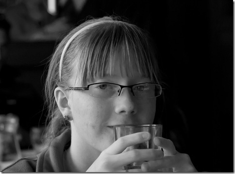
I felt at this stage that no further adjustment was required to meet the objective of the exercise – other than a slight softening by reducing clarity to –8. I cropped this final version slightly because I felt the ring was slightly distracting, and if I were printing it for display I would clone out the highlight on the top-edge and perhaps crop some more from the LHS.
Conclusion
A relatively simple set of adjustments has succeeded in lifting the portrait from the shadows in a way that would not be easily achievable in the colour version.
Emphasising aerial perspective
The challenge here is to emphasise aerial perspective in a landscape. I chose the following image – a desert landscape from the Sinai - as a starting point as it already has a strong sense of aerial perspective. It is a slight crop from the original to remove some rather unsightly road edging from the foreground. The background mountains clearly show the characteristic blue haze which adds to the perspective.
A default conversion, with all the colour channels set to zero looks as follows:
This is rather flat and un-interesting. Although there is some sense of distance, it is perhaps slightly less effective than the colour version, and there is little tonal difference between the foreground, the distant mountains and the sky.
In his book ‘The Photographers Eye’, Michael Freeman suggests that favouring the blue channel during conversion emphasises aerial perspective (Chapter 2), so that was the starting point for the final conversion.
The overall conversion figures are as follows. I lifted the blue channel +75 and the Aqua channel +95, then I reduced the overall brightness of the picture by shifting the curve (-32 lights, –52, dark, –5 shadows) and darkened the sand still further (Orange –14, Yellow +7). Finally I softened the picture very slightly (clarity –6).
Conclusion
This treatment has had the visual effect of increasing the distance to the first mountains, by losing the clear join between sand and rock, and reducing the visible detail. By reducing the contrast between the sky and the distant mountains still further it has also made them appear more distant, increasing the apparent separation between the closest mountains and the others.
Lightening skin tones
The challenge in this case is to lighten the ski tones in a portrait without significantly altering the rest of the image. M y chosen image for this exercise is a grab shot of my daughter in a roadside cafe. the right hand side of her face is somewhat lost in the shadows caused by the relatively strong lighting from the left of the photo.
The default conversion gives this result, which increases the impact of the shadow even more.
Examination of the picture shows that the skin tones are quite red/orange, so using the same principle as in the desert landscape, I started by lightening these colours to give the following (which has also had some noise reduction applied).
I felt at this stage that no further adjustment was required to meet the objective of the exercise – other than a slight softening by reducing clarity to –8. I cropped this final version slightly because I felt the ring was slightly distracting, and if I were printing it for display I would clone out the highlight on the top-edge and perhaps crop some more from the LHS.
Conclusion
A relatively simple set of adjustments has succeeded in lifting the portrait from the shadows in a way that would not be easily achievable in the colour version.
Tuesday, 24 August 2010
DPP1: Some thoughts on Assignment 3
Never really tried proper black and white photography before so am struggling a little to get started on this assignment. Having a 2-week holiday in the middle of the section didn’t help my concentration either.
Anyhow, I’ve decided to do a series of photo’s inspired by Ansel Adam’s ‘Rose and Driftwood’. it’s always been one of my favourites since I saw it at an Adam’s exhibition at the Barbican in 1987. Of course, having an inspiration and actually deciding what to do are different things, so I ‘ve scratched round the net for a while.
An obvious place to start was a search for black and white roses on Flickr. There are undoubtedly some nice shots there, although most of them seemed to be cropped quite a bit closer than the Adams shot, and lacked the contrasting textures which make it one of my favourites.
Then I came across this site, which says:
The other issue is lighting – I have a large west facing patio window – which given the current weather conditions will no doubt provide a nice diffuse light source, but whether that will pick up the finer textures of some of these backgrounds is something I’ll have to try.
Amazing how a bit of research and writing down my thoughts has crystallised them.
Anyhow, I’ve decided to do a series of photo’s inspired by Ansel Adam’s ‘Rose and Driftwood’. it’s always been one of my favourites since I saw it at an Adam’s exhibition at the Barbican in 1987. Of course, having an inspiration and actually deciding what to do are different things, so I ‘ve scratched round the net for a while.
An obvious place to start was a search for black and white roses on Flickr. There are undoubtedly some nice shots there, although most of them seemed to be cropped quite a bit closer than the Adams shot, and lacked the contrasting textures which make it one of my favourites.
Then I came across this site, which says:
“A problem was posed by the lack of a suitable background and Adams tried all manner of objects without success. Eventually he remembered this piece of wave-worn ply driftwood that he had picked up at a nearby beach. The design of the grain of the wood was a very pleasing setting to the similar shapes of the rose petals.”So there’s my theme, I need to take myself through a similar process and contrast the rose with differing backgrounds. Without the costs of 5x4 sheet film to worry about I should be able to experiment quite easily. My thoughts for background include the local sandstone (which sometimes has a grain not dissimilar to the driftwood), a sheet of rusting metal (or wire – depending on the availability of props), shredded bark, a smooth reflective surface (I have a granite chopping board which might work), perhaps a finely textured fabric – I’m already up to five.
The other issue is lighting – I have a large west facing patio window – which given the current weather conditions will no doubt provide a nice diffuse light source, but whether that will pick up the finer textures of some of these backgrounds is something I’ll have to try.
Amazing how a bit of research and writing down my thoughts has crystallised them.
Friday, 13 August 2010
Digital Photographic Practice 1: Exercise 17: Colours into Tones
Have chosen the following image for its range of tones, with the red roof, yellow-green grass and hazy blue backdrop offering a number of potential interpretations.

The default B/W conversion in Lightroom 3 appears to tweak the colour sliders to give an ‘optimum’ result. To provide a proper baseline I reset all the sliders to ‘0’ to give the following result:

The exercise asks for one set of ‘opposite’ conversions, but given the range of colours in this image I did two sets.
Red and Yellow Sliders
The LH image has the red slider at a minimum and the yellow at max. The RH image has red at max and yellow at minimum – interestingly the green slider had little effect on the grassy area.


The changes darkening the red and lightening the yellow produce a very dramatic image, enhanced by the fact that the yellow tones on the hillside behind have also been lightened, increasing the contrast between the roof and the background. On the other hand, darkening the yellows has produced a very un-natural result, with little contrast between the roof and the background, and a strange black area in the foreground.
Red and Blue Sliders
Again, the LH image has the red slider set to minimum, this time with the blue slider at max, with the reverse in the RH image.


Once again the image with the red darkened is very dramatic, and lightening the blues has increased the apparent distance to the hillside beyond – a kind of enhanced aerial perspective effect - to produce a picture which emphasises the isolation of the church in the landscape in spite of the relatively tight crop. In the right hand image, darkening the blues has increased the detail and contrast in the hillside so that it rather dominates the picture, with the church becoming somewhat lost in the detail.
Some concluding thoughts
This exercise demonstrates a little of the range of creative options available when using coloured filtration in B/W photography. From my limited understanding I suspect that digital filtration is considerably more flexible than the use of real filters in this regard. For example, I can choose to darken a red with no impact on the tonality of the other colours, and in Lightroom at least there are 8 colour channels to adjust during the conversion process. I also find it interesting that the most effective of the four examples above (red min, blue max) is in many ways the one least like the original in terms of tonality.
The default B/W conversion in Lightroom 3 appears to tweak the colour sliders to give an ‘optimum’ result. To provide a proper baseline I reset all the sliders to ‘0’ to give the following result:
The exercise asks for one set of ‘opposite’ conversions, but given the range of colours in this image I did two sets.
Red and Yellow Sliders
The LH image has the red slider at a minimum and the yellow at max. The RH image has red at max and yellow at minimum – interestingly the green slider had little effect on the grassy area.
The changes darkening the red and lightening the yellow produce a very dramatic image, enhanced by the fact that the yellow tones on the hillside behind have also been lightened, increasing the contrast between the roof and the background. On the other hand, darkening the yellows has produced a very un-natural result, with little contrast between the roof and the background, and a strange black area in the foreground.
Red and Blue Sliders
Again, the LH image has the red slider set to minimum, this time with the blue slider at max, with the reverse in the RH image.
Once again the image with the red darkened is very dramatic, and lightening the blues has increased the apparent distance to the hillside beyond – a kind of enhanced aerial perspective effect - to produce a picture which emphasises the isolation of the church in the landscape in spite of the relatively tight crop. In the right hand image, darkening the blues has increased the detail and contrast in the hillside so that it rather dominates the picture, with the church becoming somewhat lost in the detail.
Some concluding thoughts
This exercise demonstrates a little of the range of creative options available when using coloured filtration in B/W photography. From my limited understanding I suspect that digital filtration is considerably more flexible than the use of real filters in this regard. For example, I can choose to darken a red with no impact on the tonality of the other colours, and in Lightroom at least there are 8 colour channels to adjust during the conversion process. I also find it interesting that the most effective of the four examples above (red min, blue max) is in many ways the one least like the original in terms of tonality.
Digital Photographic Practice 1: Exercise 16: Strength of Interpretation
Part 1: A photo processed with a strong increase in contrast.
I took this photo of a thistle for this exercise because of the very pronounced shape, which i felt would probably benefit from conversion to B&W. The hairy stems in the background caught the light over quite a large area area in the background and detracted somewhat from the composition. As an exercise I burned it in, after conversion, to examine the differences between colour and B&W in this area. My experience is that the burning in was simpler on B&W as the greyish tone that results blends better with the photo.
Anyway – here is the original image – taken at 1/250sec, f/10, ISO400

And here are the two high contrast versions. Examination in Lightroom showed extensive shadow clipping as required by the exercise.


Interestingly , in this example I think both work. The difference is that the B/W version encourages you to concentrate on the shape and edge lighting of the thistle, while the colour version provides a more surreal colourscape. Preference in this case seems a matter of personal choice, but in a different photo the rather dramatic colour shifts could easily result in a less acceptable result. This is illustrated in the next set.
Part 2: A photo processed to give a high-key result.
I struggled in image choice for this exercise. High key is not a treatment I enjoy – to my mind it is overused, particularly in portraiture. I finally settled on this image, from a recent family holiday. (1/200sec, f/6.3, ISO200) because I felt that the obvious sunny setting might be emphasised by a high key treatment.

The two high key versions are here:


In this example the B/W version seems, to me anyway, to have a lazy summer afternoon feel.The slightly pale tones give a summer sunlight effect that matches well with the calmness of the water and the generally relaxed attitude of my son and daughter. The colour version on the other hand simply looks over-exposed and washed out, and the colours are somewhat un-natural – particularly the pinks of the skin. So my initial assessment for this photo was correct – the high-key black and white does complement the sunny setting.
I took this photo of a thistle for this exercise because of the very pronounced shape, which i felt would probably benefit from conversion to B&W. The hairy stems in the background caught the light over quite a large area area in the background and detracted somewhat from the composition. As an exercise I burned it in, after conversion, to examine the differences between colour and B&W in this area. My experience is that the burning in was simpler on B&W as the greyish tone that results blends better with the photo.
Anyway – here is the original image – taken at 1/250sec, f/10, ISO400
And here are the two high contrast versions. Examination in Lightroom showed extensive shadow clipping as required by the exercise.
Interestingly , in this example I think both work. The difference is that the B/W version encourages you to concentrate on the shape and edge lighting of the thistle, while the colour version provides a more surreal colourscape. Preference in this case seems a matter of personal choice, but in a different photo the rather dramatic colour shifts could easily result in a less acceptable result. This is illustrated in the next set.
Part 2: A photo processed to give a high-key result.
I struggled in image choice for this exercise. High key is not a treatment I enjoy – to my mind it is overused, particularly in portraiture. I finally settled on this image, from a recent family holiday. (1/200sec, f/6.3, ISO200) because I felt that the obvious sunny setting might be emphasised by a high key treatment.
The two high key versions are here:
In this example the B/W version seems, to me anyway, to have a lazy summer afternoon feel.The slightly pale tones give a summer sunlight effect that matches well with the calmness of the water and the generally relaxed attitude of my son and daughter. The colour version on the other hand simply looks over-exposed and washed out, and the colours are somewhat un-natural – particularly the pinks of the skin. So my initial assessment for this photo was correct – the high-key black and white does complement the sunny setting.
Subscribe to:
Posts (Atom)

 Posts
Posts

