These look like useful advice for Exercise 24 so I’m saving them here.
Ask An Expert: Photoshop Unsharp Mask Vs. Lightroom’s Sharpening Tool « Bret Edge Photography
6 steps for sharpening in lightroom
Sunday, 14 November 2010

Wednesday, 10 November 2010
Book Reviews
One of the good things about this course is/was that it has encouraged me to read books about photography that are more than ‘how to’ books. I started back at the beginning of the course with Charlotte Cotton’s ‘The Photograph as Contemporary Art’. As I acknowledged at the time I was ill equipped to make much in the way of intelligent commentary as so much of the discussion was well outside more normal sphere of discussion.
So in the interim I’ve tackled a couple of books which I hope will help me address that weakness. I’ve concentrated on a threesome from the reading list:
Anyway, as I’m drawing to the end of this course (my final assignment is due by mid-December) I thought I’d start to tie up some loose ends to help me put together a reflective summary of the whole thing. Among those loose ends is a short series of reviews covering what I believe I’ve extracted from the above books. I’ll be uploading them as separate posts, starting with the Liz Wells book.
So in the interim I’ve tackled a couple of books which I hope will help me address that weakness. I’ve concentrated on a threesome from the reading list:
- Liz Wells: Introduction to Critical Photography
- Roland Barthes: Camera Lucida; and,
- Susan Sontag: On Photography.
Anyway, as I’m drawing to the end of this course (my final assignment is due by mid-December) I thought I’d start to tie up some loose ends to help me put together a reflective summary of the whole thing. Among those loose ends is a short series of reviews covering what I believe I’ve extracted from the above books. I’ll be uploading them as separate posts, starting with the Liz Wells book.
Tuesday, 9 November 2010
Wordle–a visual image of your course work
Came across this site – http://www.wordle.net/ - while surfing recently. It doesn’t seem to have much serious intent , but certainly provides an intriguing view of my blog. The words are sized according to the frequency I use them. Unsurprisingly the words image, exercise, colour and photo are prominent. The one colour that leaps out at me - other than white - is blue, which is probably unsurprising as I love shots with deep blues in them. The technical nature of the course is revealed in the prominence of words such as exposure, noise, balance, RAW, contrast, detail etc. It will be an intersting exercise to compare a similar wordle for my blog as I near the end of People and Place - which on first reading of the course material seems much more picture orientated.


Friday, 5 November 2010
Back-ups – a few thoughts
My back up hard drive was getting close to full and a close inspection showed that I had multiple copies of large numbers of the photos backed–up. The basic reason for this was that I had set my back-up software not to delete moved files. A couple of days work recovered around 30 gigs of space.
To avoid a repeat of this I have now set up Lightroom so that I automatically back up the original file on import (well semi-automatically as I have to specify a folder name each time). I’m also making more effective use of Lightroom’s ability to save several version of any given RAW file in its catalog without the need to produce a Tiff or jpeg for each version.
The more I use Lightroom the more useful it seems as a tool for post-capture workflow. I almost never use Elements now, and have not used Picasa for cataloguing or viewing since I installed Lightroom.
To avoid a repeat of this I have now set up Lightroom so that I automatically back up the original file on import (well semi-automatically as I have to specify a folder name each time). I’m also making more effective use of Lightroom’s ability to save several version of any given RAW file in its catalog without the need to produce a Tiff or jpeg for each version.
The more I use Lightroom the more useful it seems as a tool for post-capture workflow. I almost never use Elements now, and have not used Picasa for cataloguing or viewing since I installed Lightroom.
Monday, 18 October 2010
DPP1: Exercise 23 : Subtraction
By happy coincidence I find I’ve completed the technical requirement for this exercise in response to my tutors comments on my first assignment.
This is the photo I submitted to the assignment:

My tutors comment was that he would have preferred to see more of the woman on the right, but perhaps I should clone her out altogether to leave a character portrait of the man – which is what I did:

I also took the opportunity to clone out the doorbell to reduce the ‘modernity’ of the picture. Interestingly the door was quite difficult to do convincingly. It would have been easy to produce a featureless layer of black – but that’s what it looked like – on the other hand – I had relatively little information to work with on the door details so I added in what I feel is enough to give a convincing result without risking obvious re-use of picture elements.
Ethical issues
I am clear in my own mind that manipulating a photo in this way is not un-ethical providing the intent is not to deceive. In this case it is done to produce a better portrait of the man in period dress – and for no other reason.
Clearly the editor of the Toledo Blade did not share my view in these examples.
As a counter example – it is clearly un-ethical to remove people who subsequently become political opponents from photos as in these examples – although, given that these are pre-digital you have to admire the skill of the air-brushers.
This is the photo I submitted to the assignment:
My tutors comment was that he would have preferred to see more of the woman on the right, but perhaps I should clone her out altogether to leave a character portrait of the man – which is what I did:
I also took the opportunity to clone out the doorbell to reduce the ‘modernity’ of the picture. Interestingly the door was quite difficult to do convincingly. It would have been easy to produce a featureless layer of black – but that’s what it looked like – on the other hand – I had relatively little information to work with on the door details so I added in what I feel is enough to give a convincing result without risking obvious re-use of picture elements.
Ethical issues
I am clear in my own mind that manipulating a photo in this way is not un-ethical providing the intent is not to deceive. In this case it is done to produce a better portrait of the man in period dress – and for no other reason.
Clearly the editor of the Toledo Blade did not share my view in these examples.
As a counter example – it is clearly un-ethical to remove people who subsequently become political opponents from photos as in these examples – although, given that these are pre-digital you have to admire the skill of the air-brushers.
Sunday, 17 October 2010
SnapIt: A handy little utility I’ve just discovered and wanted to share
The Print Screen button is a pretty handy item which allows you capture what on the screen so you can add it to your learning log, or whatever, but versatile it isn’t. If you want to save the shot for later reference your have to paste it into some other software and save it from there, and if you only want to capture part of the screen you have to crop it with image editing software.
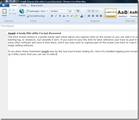
If you share these frustration SnapIt may be the tool you’ve been looking for. Once it’s installed you have to run the program in the usual way with a double click, which puts a little icon in the system tray. A little niggle – but a ‘run from start-up’ option would be nice. Once it’s up and running tapping ‘print screen’ brings up a little cursor that you can use to select either the whole screen, like this:
or just a part of the screen, like this:

You can paste the result into other major software (Word. PSE etc) in the usual way although, oddly, this doesn't work with LiveWriter2011 or Mail . Unlike Print Screen though, you can right click the tray icon and save as jpeg,gif, tif, png or bmp for later use. Better still, you can customise SnapIt to automatically save these snippets in a folder of your choosing as you go using a prefix with an incremental number in it so that the files are named Prefix1, Prefix2, etc, etc. Like this , in fact: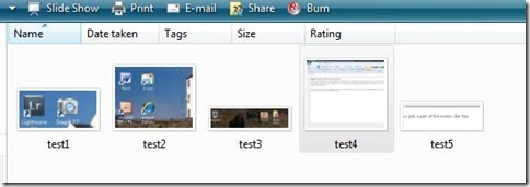
To my mind this little benefit more than outweighs the fact that the paste is not compatible with everything. The files appear to be saved at the native resolution of your screen – it’ll produce a life size image when you next use it unless you choose to reduce it or enlarge it yourself.
And that’s it really – the web is full of little utilities that you download and never use, but for a shade over £10 I think this is worth the money. Obviously you could achieve the same effect by pasting into an image editor, but this is much quicker and simpler.
Pro's
I can see it having quite a lot of uses in my learning logs capturing what I did to achieve a particular effect in post-processing, and I suspect it has a lot wider uses in blogging, writing, producing manuals – on fact anywhere you might want to show or archive what you see on the screen. If you’re interested you can download a trial version from Digeus Software
If you share these frustration SnapIt may be the tool you’ve been looking for. Once it’s installed you have to run the program in the usual way with a double click, which puts a little icon in the system tray. A little niggle – but a ‘run from start-up’ option would be nice. Once it’s up and running tapping ‘print screen’ brings up a little cursor that you can use to select either the whole screen, like this:

or just a part of the screen, like this:

You can paste the result into other major software (Word. PSE etc) in the usual way although, oddly, this doesn't work with LiveWriter2011 or Mail . Unlike Print Screen though, you can right click the tray icon and save as jpeg,gif, tif, png or bmp for later use. Better still, you can customise SnapIt to automatically save these snippets in a folder of your choosing as you go using a prefix with an incremental number in it so that the files are named Prefix1, Prefix2, etc, etc. Like this , in fact:

To my mind this little benefit more than outweighs the fact that the paste is not compatible with everything. The files appear to be saved at the native resolution of your screen – it’ll produce a life size image when you next use it unless you choose to reduce it or enlarge it yourself.
And that’s it really – the web is full of little utilities that you download and never use, but for a shade over £10 I think this is worth the money. Obviously you could achieve the same effect by pasting into an image editor, but this is much quicker and simpler.
Pro's
- Makes Print Screen a much more useful tool
- small download (a couple of megs)
- the automatic save routing is a real plus
- You have to start it each time you turn the computer on – it would be nice if it had a ‘run at start-up’ option.
- the paste option doesn't appear to work with WindowsLive type programs
I can see it having quite a lot of uses in my learning logs capturing what I did to achieve a particular effect in post-processing, and I suspect it has a lot wider uses in blogging, writing, producing manuals – on fact anywhere you might want to show or archive what you see on the screen. If you’re interested you can download a trial version from Digeus Software
Friday, 15 October 2010
Digital Photographic Practice 1: Exercise 22: Addition
Several false starts at this exercise…not least because the weather has not co-operated with the requirements of the photo to be taken. In the end I decided to move on with some shots taken from my archive. In this respect I’m lucky that I have, in the past, taken shots with the deliberate intent of being able to combine them later if I wanted to.
On the downside, I have seldom taken these with a tripod (usually because of limits on luggage), relying instead on other less stable methods of keeping the shots properly aligned. The exercise also emphasised the need for care in the subjects that you use with these particular techniques
My first attempt – and one of the false starts referred to above - used these two shots of a wooden barn in Switzerland.


The two shots were taken at 17mm; f/11; 1/200 and 1/50 respectively and they are sufficiently close in alignment to allow an accurate overlay by making use of a small ‘nudge’ on the top layer. Unfortunately there is a small amount of motion blur in some of the vegetation in the lighter version which means we can never obtain a really high-quality print. However, for the exploration in this exercise the movement is not the issue.
Using the Eraser Tool 1
In this version I have used the eraser tool, but rather than go for a total erase I have reduced the opacity to 10% and worked over the sky area several times with a relatively large soft edged eraser– bringer more detail back in to the blown out areas of sky and blending them down to the darker areas.

As the student notes observe, this does not give fine control of the area affected. On the other hand it does provide very good control over the level of improvement/replacement making it easy to obtain a natural looking result. So far, so good. Unfortunately by contrast the ‘select and delete’ method suffers from a number of problems.
Select and Delete 1
I could only obtain poor results with this technique.
2nd Attempt
Most of these difficulties are down to the choice of subject/image – so I repeated the exercise with an image with a much simpler skyline. The relatively smooth contours and lack of fine skyline detail in this image make selection much simpler.


The two exposures are (EXPOSURES) respectively.
Eraser Tool 2
Again using a large soft-edged eraser it is relatively straightforward to restore detail to the sky in a relatively natural way. I have not restored all the detail in the brightest areas as I felt this was more consistent with a contre-jour shot such as this. Note that I used the same technique to reduce the specular highlights on the water and add detail to the waterfall as well.

Select and Delete 2
The select and delete shot is also an attractive option. It was certainly more difficult to obtain a natural looking blend between the new sky and the original landscape but I am reasonably happy with this outcome. Note that I used the eraser brush technique to improve the waterfall and river, as previously – use of the delete technique is not effective here because of the exposure difference.

Adding a new sky
The image I chose for this also has a relatively simple skyline, but I ran in to the issue explored in the previous exercise – that is, I had to use personal judgement to some degree to select the skyline as the boundary between the snow field and the cloud was not always clear cut. The replacement sky was taken from an image which had sunlight from roughly the same direction.


The end result is considerably more attractive than the original. I slightly increased the lightness of the blue sky by moving the white point down to 194 in levels, and also slightly reduced the ‘blueness’ using the colour variations tool to achieve a more natural effect.

Conclusions
First the practical ones:
On the downside, I have seldom taken these with a tripod (usually because of limits on luggage), relying instead on other less stable methods of keeping the shots properly aligned. The exercise also emphasised the need for care in the subjects that you use with these particular techniques
My first attempt – and one of the false starts referred to above - used these two shots of a wooden barn in Switzerland.
The two shots were taken at 17mm; f/11; 1/200 and 1/50 respectively and they are sufficiently close in alignment to allow an accurate overlay by making use of a small ‘nudge’ on the top layer. Unfortunately there is a small amount of motion blur in some of the vegetation in the lighter version which means we can never obtain a really high-quality print. However, for the exploration in this exercise the movement is not the issue.
Using the Eraser Tool 1
In this version I have used the eraser tool, but rather than go for a total erase I have reduced the opacity to 10% and worked over the sky area several times with a relatively large soft edged eraser– bringer more detail back in to the blown out areas of sky and blending them down to the darker areas.
As the student notes observe, this does not give fine control of the area affected. On the other hand it does provide very good control over the level of improvement/replacement making it easy to obtain a natural looking result. So far, so good. Unfortunately by contrast the ‘select and delete’ method suffers from a number of problems.
Select and Delete 1
I could only obtain poor results with this technique.
- The new sky is much too dark and un-natural looking and cannot be selectively improved using this technique (although others could be employed)
- The soft edge of the clouds where they fall over the hills is difficult to select and feather to make a convincing blend
- Although selection is more accurate that a simple eraser the individual spaces between the leaves of the small tree in the foreground are difficult and very time consuming to select and result in an un-natural appearance.
2nd Attempt
Most of these difficulties are down to the choice of subject/image – so I repeated the exercise with an image with a much simpler skyline. The relatively smooth contours and lack of fine skyline detail in this image make selection much simpler.
The two exposures are (EXPOSURES) respectively.
Eraser Tool 2
Again using a large soft-edged eraser it is relatively straightforward to restore detail to the sky in a relatively natural way. I have not restored all the detail in the brightest areas as I felt this was more consistent with a contre-jour shot such as this. Note that I used the same technique to reduce the specular highlights on the water and add detail to the waterfall as well.
Select and Delete 2
The select and delete shot is also an attractive option. It was certainly more difficult to obtain a natural looking blend between the new sky and the original landscape but I am reasonably happy with this outcome. Note that I used the eraser brush technique to improve the waterfall and river, as previously – use of the delete technique is not effective here because of the exposure difference.
Adding a new sky
The image I chose for this also has a relatively simple skyline, but I ran in to the issue explored in the previous exercise – that is, I had to use personal judgement to some degree to select the skyline as the boundary between the snow field and the cloud was not always clear cut. The replacement sky was taken from an image which had sunlight from roughly the same direction.
The end result is considerably more attractive than the original. I slightly increased the lightness of the blue sky by moving the white point down to 194 in levels, and also slightly reduced the ‘blueness’ using the colour variations tool to achieve a more natural effect.
Conclusions
First the practical ones:
- The select and delete method is simple and effective but requires quite a bit more time to complete, and offers considerably less control over the final product when simply replacing one exposure with another.
- Either technique works more easily with less detailed skylines. Pictures where the cloud impinges on the landscape are best managed with the eraser tool technique.
- When replacing a sky, care is needed to obtain a reasonably natural looking edge as the opportunities for blending are much reduced.
- I see no issue with simply using these techniques to compensate for the dynamic range limitations of the sensor as in the first two examples.
- Some may feel that replacing a sky with a completely different one is ‘cheating’ – the scene never looked like that. Be that as it may the final version is much closer to my memory of that visit – and as this is a holiday photo for my own purposes there is no issue.
- For other uses I believe the general conclusions of my recent post still hold – provide there is no intent to deceive use of this technique is fine. For example – a website for Icelandic holidays could reasonably use this photo to illustrate the location, because days with bright blue skies do – regularly – occur here. In such a circumstance this is simply a way of overcoming the practical difficulties of reaching a relatively remote location at exactly the right time.
- On the other hand – when used to mislead – for example by adding a backdrop of distant mountains to the brochure photo of a hotel there are clearly some ethical issues to be addressed. As a working press officer I have been subjected to this treatment of our plants on a number of occasions – all of which resulted in phone-calls to the editor or picture desk.
Subscribe to:
Posts (Atom)

 Posts
Posts

