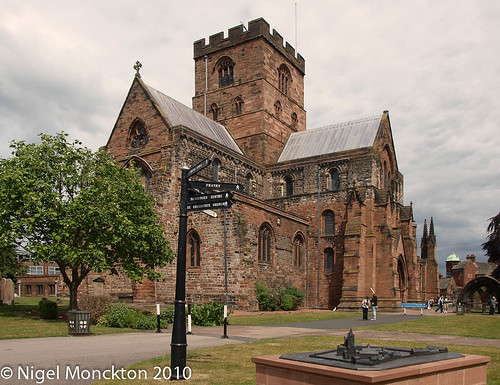
Tuesday 29 June 2010

Digital Photographic Practice 1: Exercise 11 RAW

For this exercise I visited Carlisle Cathedral. I expected to find plenty of opportunities for high dynamic range images among the shadows of the exterior stonework and in the interior with the stained glass windows. I also expected to find plenty of examples of artificial  lighting, although in this I was disappointed as most of the lighting was halogen spotlighting, which appears to have a colour similar to that of natural daylight. In the end I used a group of candles as they represent an extreme example of artificial light.

Daylight shot
This is the jpeg from the camera. It has had a colour cast correction based on the clouds to the left of the frame, been slightly desaturated and the perspective has been corrected. P6256315a.jpg 

This is the jpeg as produced from the RAW file. The file showed blinkies in the shadows under the arch to the right of the picture.
Contrast was reduced slightly, a manual white balance based on the same clouds as before, then a curves adjustment to lift the dark shadow under the arch, and the mid tones have been lifted slightly. The perspective was corrected in jpeg.
P6256315fromRAW.jpg

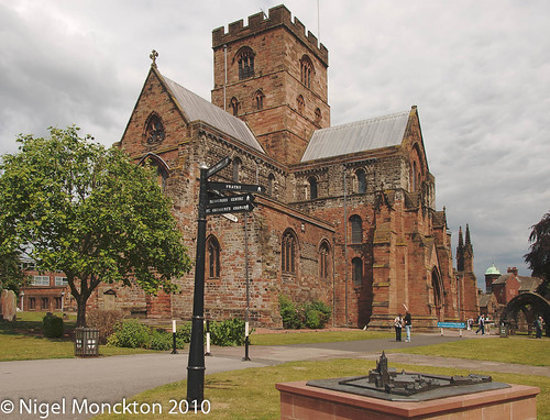
Given that the white balance was taken from the same patch of gray cloud this shot is somewhat more yellow in the grass and stonework than the direct jpeg. It also shows more fine detail in the shadow areas and at full size more subtle shading detail in the clouds.
Whether the extra detail in the shadow in this shot is worth the additional effort is questionable – however for a shot with much more shadow this might become a deciding factor in the use of RAW.

High dynamic range shot
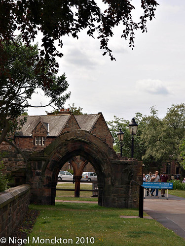
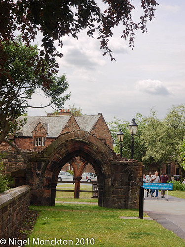
This was taken from the opposite side of the dark arch, towards a sky with a lot of thin backlit cloud. It as taken with –0.7 stops exposure to retain detail in the sky. White balance was taken at auto and left unchanged in development.
P6256309a.jpg
This one is the camera jpeg. The brightness and contrast were reduced very slightly using the sliders in Photoshop Elements, then the mid tone pointer in the level box was adjusted to 1.44. Finally sharpening at 30%/100px was applied. This approach retained some reasonable detail in the clouds, but the overall picture is still quite dark.
Note that the version of PSE I am using does not have a curves adjustment. 

This version  produced from the RAW file shows a lot more detail in the cloud, significantly improved shadows and even brings life back in to the trees.
P6256309fromRAW2.jpg
My first attempt at this image produced an image noticeably worse than the out-of-camera (OOC) jpeg, with a very complex curve adjustment. However, the benefit of the mid-tone slider in the levels box on the OOC version suggested an alternative approach, so I went back to the RAW file and tried simply reducing exposure by 0.1EV, lifting the centre portion of the curve and then pulling down the top end to return detail to the clouds.
This is a significant improvement on the OOC version.

Artificial Light
As noted in the intro I resorted to using candles as the artificial light source. The shot was taken at ISO400 and with incandesent light balance (3000K) 

This is the OOC jpeg with the colour cast corrected for the base of the 2nd candle in the top row. The mid-tones were lifted using the levels slider to 1.23 P6256328a.jpg
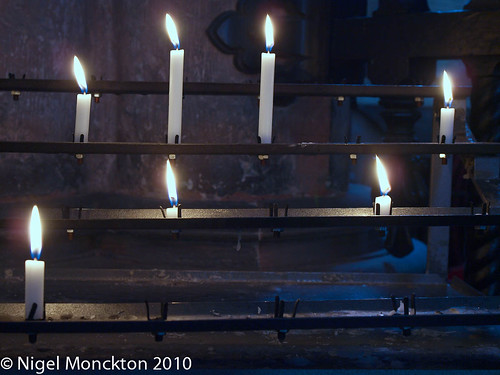
The areas where the daylight through the windows falls a have a clear blue cast. The mid-tones were lifted using the levels slider to 1.23, which enhances the feeling of ‘light in the dark’. 

This is the version from the RAW file. Again a simple lift of the middle portion of the curve lifts the mid-tones without affecting the highlights adversely. The white balance, from the same spot as above produces a more ‘neutral’ effect, with some yellow around the candles and the areas of pronounced blue tinge much less extensive. P6256328fromRAW.jpg

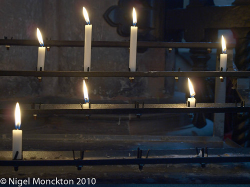
This is still not close to the way it appeared to the naked eye, but it does appear more natural. Whether this is the desired effect is a matter of artistic judgement. On balance I prefer it because of the extra warmth.
Both versions show some noise in the lifted mid-tones, as might be expected from the outcome of previous exercises.


Conclusions
Much is made of the benefits of RAW shooting in photographic forums and magazines., although there are always people to defend/argue the merits of jpegs. In the case of simple daylight shots it is arguable that there is much merit in the extra work that RAW entails – however in high contrast, or oddly it scenes it clearly offers much more control without adversely effecting quality.
I have been a RAW shooter for some time, and although this exercise has highlighted the relatively small gains to be had in normal circumstances, I prefer the safety net of the RAW file and will continue shooting that way.

Wednesday 16 June 2010

Digital Photographic Practise 1: Exercise 9: Scene Dynamic Range

For the first shot in this exercise I chose a typical country scene in scene full sunshine.
P6126093
The bright spot in the clouds was 1/1250 at  f/8 and ISO200. Although the hedgerow on the left looks relatively dark in  this image the meter read 1/30 at f/8, giving a total dynamic range of about 4.5 stops. This is well within the range of the camera, and a different treatment of the RAW reveals detail in the hedgerow at the expense of the overall effect of the picture. As with white balance and exposure, dynamic range can be manipulated to some degree to achieve a particular effect. I this case the contrasty result enhances the impression of bright sunshine.
Another shot taken in bright sunlight, this Bleeding Heart also has a relatively modest dynamic rangeP6126097
The white on the flower registers 1/640 at f8 (ISO200) while the dark shadow registers 1/50 – around 3.5 stops. This feels a little narrower than it looks – in particular the shadows are quite dense – and may reflect the fact that even the spot metered point is not sufficiently small to accurately measure the small proportion of the picture represented by the white of the flower or the deepest shadow areas.
Two pictures now of the same scene in slightly different lighting:
This one, with sunlight outside shows a range of 1/1600, f8, ISO 200 (in the sky) to 4 secs at f8 (in the shadow by the printer on the left. This is almost 13 stops - well outside the range of my camera although a barely acceptable image has been achieved by relying on the fact that we would expect some deep shadows in this kind of image (at the sacrifice of some detail) and the area of sky is sufficiently small that it is not too obtrusive . It is unlikely that this would make a good print however.
P6126100
In this version, on the other hand, the weather is cloudy outside, a greater proportion of the interior light is coming from an unseen window to the right of the picture and the sun is not facing the camera position. The sky now measures 1/800 at f8 and the shadows around 2secs giving around 10.5 stops. This is still outside the range of the camera but it is certainly easier to use the image. This hints at two ways of controlling contrast – use of a more diffuse lighting source, and using extra lighting to fill the shadows.
P6136117
Finally another outdoor shot in very flat cloudy evening light.DPP-Assignment-2_10
According to the camera meter this has a range of less than 2 stops: 1/25, f8, ISO200 (on the tree through the arch) to 1/80 (on the wire and woodwork.  This gave a rather dull image without enhancing the contrast in RAW development.
Thoughts on dynamic range
A couple of my thoughts on this issue:
  • anything with brightly lit cloud in the picture is likely to have high dynamic range
  • bright sunshine is not necessarily a problem unless there are well lit clouds in the sky
  • flat lighting and low contrast can be as challenging to a photographer as pictures with a high contrast.
  • low contrast pictures can be perked up in post processing if more contrast is required
  • high contrast pictures are more difficult to manage because the captures file has to sacrifice detail in either the shadows or the highlights. the former is generally a better solution.
  • counter-intuitively using flash, or additional lighting/reflectors can reduce contrast at the point of capture and give a more manageable file.

Saturday 12 June 2010

Digital Photographic Practice: Exercise 10 (ii): Colour Cast and White Balance

Mixed Incandescent and Natural Light
The following shots were taken in my back garden about an hour before sunset on a completely overcast evening. The focal length was 50mm and the exposure between 1/8 and 1/10, f/8 and ISO400 with image stabilisation on.
OLYMPUS DIGITAL CAMERA
The wallpaper in the dining room is a relatively strong yellow, but has taken on a distinct orange tone in all but the ‘tungsten’ lighting setting, which is the most accurate for the interior – see also the colour of the paper on the music stand in the background.  However, the dining chairs, by comparison have taken on a blue tone in the ‘tungsten’ setting as they are receiving considerable light from the patio windows.
The ‘auto’ setting has clearly biased itself towards the exterior lighting conditions, producing a neutral colour to the grey render and the strongest orange in the interior, while the ‘sunny’ white balance tones down the orange, but has produced a rather un-natural blue tone to the render.
The frame labelled ‘personal choice’ is actually balanced with the ‘cloudy’ setting. This has produced a more accurate colour on the wall than ‘sunny’ – although slightly bluer than ‘auto’. However the orange of the interior is less pronounced, and the green of the vegetation is a little ‘fresher’. To me this is the best balance that can be achieved in this image without resorting to blending images. It manages to convey the contrast between a rather cold and dreary evening and the relative warmth of the dining room without appearing too artificial.
General tinkering with the sliders produced no overall improvements in the final image to my eye.
Conclusion
In mixed lighting there is no technically correct answer because correctness depends on which light source you consider as the primary one. The others are then, inevitably, less accurately portrayed. So, even more than in the single lighting case the choice of white balance in mixed lighting is down to the desired artistic effect.

Digital Photographic Practice: Exercise 10(i): Colour Cast and White Balance

Have decided to get on with this exercise as I’ve not had the chance to go out and shoot for Ex 9 yet, whereas I’ve been collecting shots for this one for a while.
What I would expect from this exercise is that photos taken in high colour temperature light will appear cool (or bluish) when using a light balance for a lower colour temperature, and conversely, photo taken in lower temperature lighting will take on a more red/yellow tone when using a higher temperature light balance. The classic example of this latter effect is the orange appearance of photos lit by tungsten lights and taken on normal film, or outdoor colour balance settings.
Sunny conditions
All the following, which were taken near Bothel, Cumbria, were shot at 14mm, using 1/80 at f/9 and ISO 100.
OLYMPUS DIGITAL CAMERA
As we can see even in this small picture the ‘cloudy’ version is less blue than the ‘sunny’ version, and the ‘shade’ version even more so. In the latter case the clouds begin to take on a rather un-natural violet hue, and the overall photo looks a bit muddy. I would have expected that the ‘auto’ and ‘sunny’ setting would agree, but i reality the auto version sits somewhere between the ‘cloudy’ and ‘sunny’ versions. This is possibly because the thin high cloud visible in the photos has altered the colour temperature slightly.
Whatever the case, it feels to me that ‘auto’ gives a slightly more pleasant rendition of the scene. The ‘sunny’ version does have a very clean, crisp feel to it. If it had it been a winter scene, with bare trees and less green in the grass,  ‘sunny ‘ may actually have been the better rendition.
Cloudy Conditions
Unsurprisingly these were relatively easy to find in the north of Cumbria! The following were taken near my home, just outside Maryport. These were taken  at 43mm, and 1/80, f/5.6 ISO160
OLYMPUS DIGITAL CAMERA
The ‘Sunny’ white balance shows the blue tinge that I would have expected. The fresh green of the field in the foreground is going slightly muddy in the ‘Shade’ white balance – it is slightly too warm, although this might be a pleasing effect in a sunset picture. The ‘auto’ is slightly less blue than the ‘Cloudy’ balance, but overall I think the latter is the most pleasing picture. The colours in the ‘auto’ are slightly too flat for my tastes – notice that the yellows in the rapeseed field in the middle distance are relatively dull compared with the ‘Cloudy’ balance.
Open Shade
This shot is the front of my home, taken early on a summer evening with a clear blue sky to provide lighting. The exposure was 1/25, f/8 ISO 200 at 22mm.
OLYMPUS DIGITAL CAMERA
The ‘auto’ and ‘cloudy’ settings produce outputs with a slight blue tone – clearly visible in the white of the door, and the ‘fine’ (sunny) setting produces an even stronger effect.  The ‘shade’ setting produces neutral whites and a more pleasing tone in the pebble dash, but the grass appears a little too green and the reds in the azalea seem a little too saturated. Overall it is the most pleasing, but there aspects of the scene which could be improved by mixing and matching white balances to some degree.
Conclusion
  • there is a technically correct white balance which produces neutral greys and whites. In some cases this is best with auto setting, but in most adjusting the balance for the specific conditions provides the most accurate output.
  • white balance can be use to enhance a scene in a particular way – i.e. it is also an artistic choice. For example, choosing a lower temperature white balance might enhance a cold scene by adding a touch of blue, whereas choosing a white balance at too high a colour temperature might enhance a sunset scene.

Sunday 6 June 2010

Exercise 8: Camera Dynamic Range

Here is the photo used as the basis for this exercise. I followed the suggested subject in the notes as my front door is a close match to the suggested arrangement.
DPPEx803a
In the full size original the piece of white card (behind the doormat) shows some clipping in the bottom right corner but checking with the eye-dropper tool shows RGB values less than 250 for all but the extreme bottom right. The exposure was 1/200; f/11;ISO 100 - about 2/3 of a stop below the camera recommended figure.
The blue carpet on the stairs has a small pattern which is useful for this exercise.
The metered figures from around the scene are given in this picture (all at f/11, with 0.7 EV underexposure dialled in as per the original shot). This is clearer in the full size image.
DPPEx803
The reading on on the white card is 1/1000 sec. Just above the envelope on the stairs is a black shoulder bag (on the second stair) which records a reading of 1/3 sec. The stair pattern is clearly visible without too much noise interference. By the seventh stair (1.3 sec – approx 2 stops darker) the pattern is lost in the noise, so the bottom end of usability is around 2/3 sec giving a practical dynamic range that runs from about 1/1000 to 0.6 seconds – around 9 stops – which compares reasonably well with the lab figures on DP Review a well known (and respected) source of digital camera reviews

Noise – thoughts on the photos in the resources section

Before moving on to the dynamic range exercises I thought I should record my thoughts on the ‘Grey Texture’ and ‘Turkish Dancer’ images.
First off - the grey texture. As the caption to the photo in the notes says, distinguishing detail from noise is ultimately subjective. While the print in the notes supports the view that the blotchiness is real the 200% crop suggests otherwise, on my screen at least. The blotchiness is definitely yellowy-green and blue and quite ugly – not something I would find acceptable at full size, (I confirmed this by reducing the image to 100%) although I suspect at smaller sizes it might be usable – as it clearly is in print. The notes suggest this is real detail but I am unconvinced – the only real detail I could make out in the fabric was a trace of vertical pin-striping just below the sleeve. This vertical patterning became slightly more obvious once the size was reduced.
Moving on to the Turkish dancer I find the noise much less intrusive. As the notes suggest, the level of detail in the silver brocade is comparable to the detail in the noise, and the noise over the velvet areas shows much less pronounced colouring and evidence of noise is very much reduced once the crop is reduced to 100% size rather than the 300% presented. I think also that the slight movement blur also acts to disguise the effect of the noise in some way, which also reduces its intrusiveness.

Friday 4 June 2010

Minimalism

Just finished reading Minimalism (Movements in Modern Art), by David Batchelor.
Decided to find out more about minimalism after reading this page on Michael Freeman’s website, and because I’ve been interested in the stripped down, geometric nature of a lot of modern (and not so modern) buildings for some time – click this link and image for a recent portfolio of my architecture shots.
In truth the book was not what I expected – a history of, or introduction, to Minimalism. But after reading it I think that’s because I misunderstood Minimalism. The book concentrated on the work of 5 American artists who basically invented Minimalism – much as they appear to have hated being labelled as such. As such it was a fascinating read. The concepts underlying their various works were well explained and compared, their works were placed successfully (for me at least) into the context of other art of the period and their impact on art, and art criticism, was also well covered.
So, what is minimalism? That seems difficult to pin down. As far as I understand it its not putting less in, photos of essentially nothing, close-ups in black and white or any of a range of other things that seem to get labelled as minimalist, although they could surely qualify in the right circumstances. My impression is that it is about being an object – an nothing more. There is no imagery – the works are often unadorned, plain, uniformly coloured They are also – on the basis of the works covered in this book, almost all 3-D – which is a bit of a challenge for a photograph.
So where does that leave this kind of photo, from my personal blog,  that I would once have regarded as Minimalist? I think the answer is that it’s something else, because it’s clearly representational, I like to think I composed it to provide the bare essentials for recognition (though with hindsight I could have cropped the left), and it contains a range of colours and visual textures.
So if it isn’t minimalism, what is it, and does it really matter?
In truth I think the answer to the last question is no – you can call it what you like, but what matters is ‘Does it work?’
As to ‘What is it?’. All I can say is that – inspired by the example in Michael Freemans blog – I made a sincere attempt to illustrate a table lamp using the minimum of information.  In that respect it bears some resemblance to some zen art practises which seek to capture the essence of a thing in as few strokes of the brush as possible. Taking that as my starting point I can already see how it can be improved and, at the end of the day, that’s what this is all about.

Wednesday 2 June 2010

1st Assignment Feedback

Got the feedback from my tutor about a week ago, and now feeling moderately pleased with myself.
His assessment of the better shots pretty much tallied with my own, and he made a number of helpful suggestions to improve the shots as well. Those that involved image manipulation have been completed and replaced in my profile – here.
I’ve also uploaded a pdf of my original submission here