Friday 9 July 2010

Assignment 2: Digital Image Qualities

Got the feedback from my tutor for assignment 2 yesterday. very positive again, I’m relieved to say as I found it quite a challenging exercise.
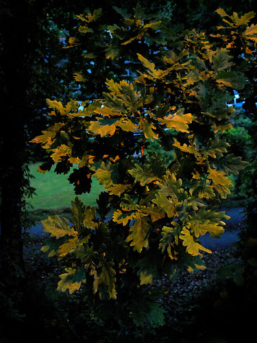
I fact, in some senses the assignment felt a little artificial – in particular the need to use high ISO. For the types of photography I currently enjoy I would normally avoid this by using a tripod – so I made a conscious decision to complete the assignment while on a business trip to restrict the time available, and to use my ‘bare minimum’ travelling kit – my E-3, the Zuiko 14-54 zoom, two spare batteries and a spare memory card.
Whatever, I took the instructions at face value and even felt this shot – taken at ISO3200 was worth including. My tutor suggested that I might want to tone down the green on the left on on reflection I think he’s right – so I’ll be tweaking it in Photoshop over the weekend.
8: Oak Leaves by street light
The rest of the assignment is available on my profile page - here

35 Stunning Examples Of Conceptual Photography

Just found this link on my Twitter feed - some really interesting - and sometimes very funny - ideas here.
35 Stunning Examples Of Conceptual Photography

Thursday 8 July 2010

Digital Photographic Practice 1: Exercise 13: Managing Colour

For this exercise I chose three photographs from my family holidays, all with pronounced colour casts where the auto white balance has not achieved a fully satisfactory result. Here they are at default settings:
OLYMPUS DIGITAL CAMERA


The boat photo has a distinct blue cast from the overcast lighting, the portrait of me (taken by make daughter) has some interesting mixed lighting which makes me look rather too tanned, and the doorway was lit by sunlight reflected from the yellow painted walls to give a very distinct yellow cast.
I am in the process of switching RAW developer from Olympus Studio – which is beginning to feel a little limited in the context of this course – to Lightroom 3. So the next three were all corrected using Lightroom before conversion to jpegs.
OLYMPUS DIGITAL CAMERA
OLYMPUS DIGITAL CAMERAOLYMPUS DIGITAL CAMERA


Even at these sizes there are some clear changes – I hesitate to use the word improvement because that’s a personal thing – although I think these are better.
For the boat I used the eyedropper tool on the superstructure behind the mast. This was a known gray - a white area in shadow. the end result was a change of colour temperature from 5100K to 5650K – which removes the blue cast neatly.
There is no obvious gray in the portrait. the shirt is in a variety of artificial lights, so using the eyedropper did not work. Instead I manually raised the colour temperature about 100Kand added a tint of +53 and increased the luminance of the blue channel a little to give a better skin tone at the expense of colours in the white shirt.
The Olympus E-1, which I used for this shot has an external colour sensor, which in this case was fooled by the light falling on the camera to give a near daylight colour temperature of 4850K. In this case the eyedropper tool used on the floor tiles reduced the temperature to 2950K and I manually tweaked the tint from the +5 recommended to –9 to warm the shot up slightly.
Finally I produced corrected versions iof the default jpegs n Photoshop Elements 2 (which has rather limited control) as follows:
OLYMPUS DIGITAL CAMERAOLYMPUS DIGITAL CAMERAOLYMPUS DIGITAL CAMERA


The boat was corrected using the mid-grey eyedropper in the Levels window and appears very similar – if a little brighter – to the RAW conversion.The portrait was corrected using the colour channels in Levels (0.86 on the red slider; 1.13 on the blue) to give a result with reasonable skin tones but somewhat less green in the shirt – which is slightly more accurate. I could not make a good correction using the Levels box in the case of the doorway – so I resorted to the Colour Cast tool and then destaurated the yellow in the Hue/Saturation box.
Conclusions
As in the previous exercise, all these outputs (with the possible exception of the default setting on the doorway) are perfectly valid, and particularly with the more subtle differences, a matter of personal taste. It is also worth noting that although Lightroom offers significantly more options, perfectly reasonable results were obtained with relatively simple software.

Digital Photographic Practice 1: Exercise 12 Managing Tone

For this exercise I chose this image – developed here from RAW at default settings in Olympus Studio.
OLYMPUS DIGITAL CAMERA
It is something of a surreal landscape from Hverarond in Iceland. Te colours are natural, and a result of the geothermal activity in the area. It was a very cloudy day, and there was quite a lot of steam blowing around so overall contrast was low.
The two people in the background were wearing very dark trousers – to all intents and purposes black, but there is little or no pure white in the shot, and nowhere obvious to do a white balance, so in Photoshop Elements colour balance is a matter of personal choice.


Next up is the post processed jpeg.OLYMPUS DIGITAL CAMERA         The black and white points were set manually using the Levels window. Final settings were 15 for the black point, and 184 for the white point. I then lifted the mid-tones by moving the centre slider to 1.20. I followed this, as is my general practise with an Unsharp mask adjustment of 20%/100pixels and finally applied a simple Sharpen which worked reasonably well on this image as there are no obvious places for haloes or other sharpening artefacts to intrude.
I also tried, and rejected, a simple auto levels. This produced a much too contrasty image for my personal tastes, rendering the pale grey areas almost white and the blue-grey areas almost black.


The next version was corrected in Olympus Studio before conversion to a jpeg.OLYMPUS DIGITAL CAMERA
First I adjusted the colour temperature to Cloudy (6000K) and added some additional red. This has the effect of making the ochre colour of the clays rather less marked, and increasing the blue in the mud deposits. I then brightened the picture overall (by 0.4EV).
At this stage I then pulled in the black and white points on the curve control and lifted the curve in the bottom half to lighten the darker tones.iceland settings


The end result is an image which is fairly faithful to the scene as I recall it.

Finally I did some further optimisation in Elements – in particular the Unsharp mask adjustment I described above and a Sharpen to give this result which has a little more punch.
OLYMPUS DIGITAL CAMERA


Conclusion
The differences between these outputs are fairly subtle, but yet again the RAW software gives just that little bit more control. There as also a certain amount of personal choice involved in establishing some of the settings. All of these pictures are legitimate interpretations of the original - I happen to prefer the last one.

Tuesday 6 July 2010

Monitor Calibration – Spyder 3 Express

I notice that the exercises leading up to Assignment 3 call for a colour calibrated monitor. Until now I have relied on a ‘by eye’ calibration. This has been relatively satisfactory as I have done little print work and generally view my images on a single monitor.
However I have noticed that images look considerably bluer on my netbook than on my desktop. As I am using this more for the course – to make better use of the time I spend in hotels on business – it seemed sensible to calibrate my monitors so that I could be reasonably sure that a change to an image on one system would have the same effect on the other.
Datavision Spyder 3 Express arriving for my birthday. My first impression was that it looked quite ‘neat’. It was well presented, appears reasonably robust and came with a microfibre screen cloth. Installation of the software is simple, then it is just a matter of starting it up, plugging the calibrator into a USB slot, placing over a nicely outlined patch on the screen and setting it to run. (You need to warm up the monitor for at least 30 minutes before starting)
First time around it runs through several different colours at gradually increasing levels of brightness in a process that takes about 5 minutes. It then calculates a monitor profile and gives you a chance to see the before and after effects before implementing the new profile.
It also reminds you to recalibrate every couple of weeks – and that’s all there is to it at this level.
The results were not dramatic, but were certainly noticeable. On my desktop it made the images ‘cooler’, and considerably increased the depth of the blacks. On my netbook it had similar effects on the contrast and removed the blue cast which I mentioned. All a bit of an anti-climax really, but it was nice to see that images now appear very similar on both monitors.
Of course, proper colour management is more complex than this – for example the piece of kit I bought does not allow me to calibrate my printer. Maybe an Xmas present in waiting.
A few notes on colour management
As my experience with monitors shows, different bits of kit display colours differently. This is particularly true of monitors and printers because they produce colours in different ways, and although the ranges of colours they produce overlap, they are not the same. I’m sure most of us have printed pictures or received them back from the processor and felt a little disappointed with the output when compared with a monitor. The purpose of colour management is to ensure that as you move from one device to another the colours you see are kept as close as possible.
In round terms a colour profile is a set of information that allows a device to make a reasonable attempt at mapping the colour information in the image file to the colours that it is capable of outputting.
For a moderately technical description I found this Wiki article quite useful, and there is also a long but helpful article on the Datavision website (obviously biased to their products but none the worse for that). Cambridge in Colour also has an excellent set of articles on the same issue,as well as several other helpful tutorials.