Monday 22 November 2010

DPP1: Exercise 24: Sharpening for Print

I found this a particularly useful exercise as I had not had the opportunity to get to grips with the sharpening controls in Lightroom, which are significantly different from those found in Photoshop Elements (at least my rather antique version). As suggested I chose a portrait as the subject for the exercise:

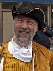
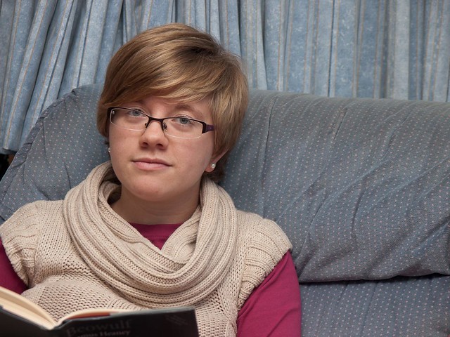
This photo has a range of details that make it useful for this exercise – very fine patterning in the suite fabric and hair, coarse but high contrast patterns in the knitwear and areas which I will want to avoid sharpening in the face.

Lightroom has two kinds of sharpening: input and output. The input sharpening  works from a set of sliders which control amount, radius, fine detail masking (which controls the area affected)) and is the primary method for sharpening the photo. Output sharpening takes the photo and adds additional sharpening to prepare the photo for display on screen or in print. Given this variety I decided to extend the exercise to test 3 levels of input sharpening, and all three levels of output sharpening (low, standard and high).
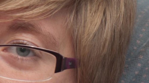
I don’t propose to show all the variations in this entry as the differences were in some cases very subtle, and given the difference in viewing medium there is a limit to the value of displaying these differences. However they are all available on my Flickr site for interest. As a starting point here is the version with no sharpening – rather than show the whole picture I have taken a face detail to show the softness:

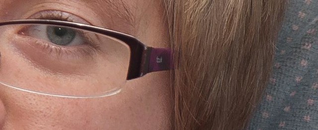
And here for comparison is a version with output sharpening set to high (I also tried this twice - once at the jpeg export stage and once at the print stage but cannot show the result here – in any case it was worse), and with input sharpening set to amount 125/Radius 2.5/Detail 15 with no masking. These are towards the top end of what the system offers.

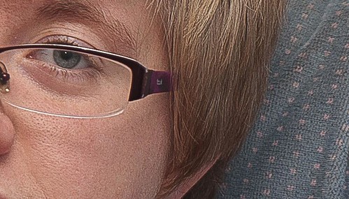
While this extreme sharpening looks OK in the fabric, it is extremely unflattering to the face, makes the hair look very wiry and leaves ugly edges along the edge of the spectacle lens. If anything this is emphasised in the print version with the facial texture becoming quite unflattering.
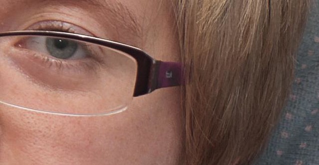
This version has the Portrait (Wide Edges) preset enabled. This equates to amount 35/Radius 1.4/Detail 15/masking 60. There is little visible difference on-screen or in print between this and the unsharpened version. Output sharpening was low

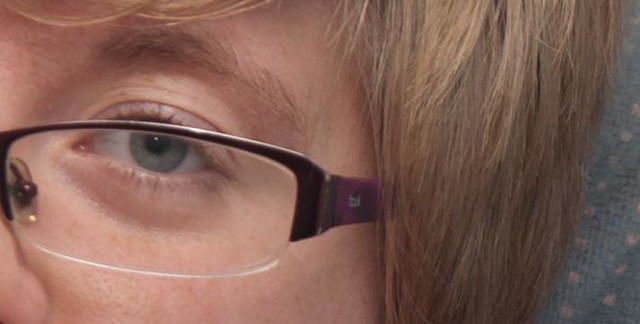
I increased the amount to 100 and reduced the masking to 30 to give the following which is notably sharper but with a more flattering skin texture. Output sharpening was low. Overall this is my preferred output from the exercise and I will be using it as the starting point for sharpening of portraits in People and Place. Further reduction in the masking and increases in the amount started to produce noticeably less attractive results

This latter output is very close in print to the portrait preset version with high output sharpening (below) although it is visibly different at 100% on screen:

Conclusion
Obviously sharpening is unavoidable – this is (in most cases) a function of the manner in which a digital camera captures the image.
Lightroom provides some powerful but subtle tools for sharpening and ultimate quality is a matter of balancing the need to sharpen against the need to avoid unsightly artefacts. The masking tool is very helpful in this regard and as the penultimate shot above shows it can provide very useful fine control on skin and hair, compared with relying on preset sharpening.
My experience from elsewhere is that images used small on–screen can tolerate considerably more sharpening than larger images. For example, when the above image is viewed at 1:4 in Lightroom the heavily sharpened version looks simply crisp because the lower resolution on the screen removes the over-emphasised skin details.

Thursday 18 November 2010

Everything is illuminated– Wolfgang Tillmans

Back at the beginning of the course I decided that I would subscribe to the BJP – for a number of reasons – not the least of which was that I wanted to see photography different from the run of the mill stuff in the consumer camera mags. I would have to admit to being baffled by some of it, but this article ‘Everything is illuminated - British Journal of Photography’ from the July edition about a Wolfgang Tillmans exhibition struck a chord – especially the bit about his still life work.
He’s described the eyes as subversive because “they are free when used freely” – that is, they ascribe value to what’s seen in front of them, no matter how expensive or banal the subject. But although many of his still lifes show ostensibly everyday scenes, in fact many are staged, and if they’re not, they’ve acquired meaning for him over a long time before shooting.
Unfortunately it wasn’t practical to visit the exhibition – it was 350 miles away to start with – so I’ve been scratching round the web trying to find some more material by and about this guy. Unsurprisingly he has a website and it has links to a number of tour catalogues which have a range of his work, and some fairly detailed essays.
On the basis of the works presented his still life work is rather different from what I expected. They have a rather grungy feel to them, and it is rather left to the viewer to extract the beauty that he apparently sees in them. On the other hand his rather more formal Paper Drop photos are quite beautiful. There is some suggestion that there is a deeper meaning associated with the ability to see both sides of the photo at once, but I think I’ll need a little more research to decide whether I think that was his intent, or a subsequent reading of the images.
His portraits, which are largely of his friends vary from the touchingly intimate – you can almost feel the friendship being expressed in the photo – to the frankly disturbing – Man Pissing on a Chair for example. Again – it’s going to take a bit more thought and research on my part to work out what’s going on here.

Wednesday 17 November 2010

Assignment 1: Review of feedback

Somewhat belatedly my reactions and responses to the feedback I received from Assignment 1.
The assignment itself was a photo-shoot in Cockermouth during this year’s Georgian Fair. As I was expecting it to be busy a tripod was not really an option, and as I explain in the submission, I rapidly settled on a 50-200 telephoto as my primary lens. If you want to read the whole submission it’s available here on Scribd.
First up I was really pleased with the feedback – I was obviously nervous as this is the first time I've had any of my photography critically assessed in a meaningful way – but happily I needn’t have been. Peter made one comment on my chosen technique (I chose to use auto ISO – limited to ISO800) to the effect that he would have limited it to ISO400. At the time I went to ISO800 as the light was so poor and I was hand-holding at fairly long focal lengths.
Subsequently I went through the tolerance to noise exercise and concluded that I would be comfortable with ISO 800 for general use, but for critical use I would stay with ISO200 or lower.
On to the individual photos:

Peter acknowledged that this set the scene well and that my choice to frame diagonally added some interest to an otherwise static shot.

“This one is a pleasant enough portrait that I am sure your friend was very pleased with. You don’t say what the exposure was but a little fill in flash would help to add a touch of “sparkle”.”
Peter suggested fill flash at 2 stops under. I’m (still) kicking myself on this one as this was an early outing with my new E-3 which has a built in flash (unlike my previous E-1) so I could have done this – had I thought of it. It’s certainly a point to remember for People and Place – and for more general use.

“The colours on this one are lovely. The maroon coloured house goes very nicely with the bushes at the front. The composition is excellent but too improve clone out the wire that is just above the right hand corner of the gate and leading to the upper floor. Also clone out the door bell just below “39” and the intercom (if that’s what it is) between the door and the side gate. Then there will be no trace of modernity on the image.”
Not an issue I’d thought of at the time of submission – although obviously the kind of improvement discussed has been a key issue in the fourth section of the course. I did all the cloning suggested with the exception of the ‘intercom’ – which on closer inspection turned out to be a brass name-plaque – which seemed reasonably in keeping with the setting.
On a broader point I think that these mods are acceptable for this and exhibition use, but I would be a little uncomfortable if I thought these cleaned up shots were going to be used to represent Cockermouth as it is now.

“I like this one very much. As you say in your notes a wide enough aperture has been used to throw the background out of focus thus concentrating the viewers eye on the main subject. Excellent.”
Nothing to add really other than to say that I was pleased that I managed to get the shot without a trace of modern clothing anywhere (other than the glasses).

“Another good shot but again to capture the period you have chosen the clone tool should be used to improve.”
This time I lost a TV aerial and a genuine intercom, together with some phone cabling.

Again this is an excellent image with no trace of modernity whatsoever. The subject has been well caught and once more a relatively wide aperture has been used to make the subject stand out from the background. Another winner.
I guess you can begin to see why I was pleased – although on reflection I think this would have been improved by a wider aperture. I checked the original and it was shot at f8 – I think f4 would have provided better isolation from the background.

“Pictorially the club is cutting off a little of the jugglers face but I know this type of shot is not easy to execute. My advice would be to take several and select the best. Also a slightly slower shutter speed would emphasize more movement in the clubs.”
I find nothing to disagree with here. ‘Burst’ mode would certainly have given me more shots to choose from and since I included it in the collection to add some life I agree with the idea about the slower shutter-speed. I am a little uncomfortable about the impact of the green plastic mac on the overall setting as well – but it was raining, so macs or cagoules were to some degree inevitable.
                                
The right hand picture is the original submission which I include here to show the scale of the change and the end result.
“Another good candid shot but for me I would like to have seen more of the lady on the right hand side. I would be tempted to clone her out altogether so that the viewers eye is concentrated on the man making him the main subject of the image.”
I agreed, and completed this before I discovered that it was the technical requirement for Exercise 23. It is a much better shot with just one person. I was tempted to go the whole way and clone out the pub sign, but decided that it added some context.

“Again you have another good candid shot but the background is a bit too distracting. A wider aperture would have given you a shallower depth of field thus concentrating the viewers eye on the couple in the foreground.”
Agree entirely. Shot at f8 when f4 would have been a better choice.

As noted in the other similar shots I have cloned out some intrusive cabling and modern wall furniture, as suggested.

“As far as I can see this image is faultless. You have included the whole of the instrument and the subjects hat has not been cropped off. Again you have used a wide aperture to render the background out of focus thus making the musician stand out. Brilliant.”
This one was taken at f4, unlike the couple above.

“Absolutely fantastic! The colours on this one are lovely and the atmospheric smoke from the guns hides any distractions in the background. Adding local contrast to the subjects faces has worked very well and the red uniform adds further impact and interest. Well done.”
A nice way to finish. I think I can see how I could have done it a little better, but my coach has told me I’m not good at accepting praise so I’m going to shut up at this point.
Conclusions
A number of practical conclusions leap out:
  • be braver with shallow depth of field,
  • work on the use of fill-in flash,
  • think about shutter speeds more carefully when trying to capture ‘life’,
  • pay more attention to the fine detail when preparing the pictures for submission.
One of the key purposes of the preceding exercises was to establish the value of a structured workflow, and this has stuck with me. I no longer find myself without a charged battery (for camera or flash), I always have a spare memory card, my filing structure has improved (with the help of Lightroom) and I now have a more solid back-up strategy.
Finally, on a personal note, I didn’t tell Peter at the time but his feedback was just the confidence boost I needed relatively early in the course.

Assignment 2: Review of feedback

The purpose of module 2 seems to have been to develop an understanding of how digital cameras behave in differing conditions and the impact that has on the quality of the final image. I noted in my submission the assignment felt a little artificial and I emphasised the challenge in this by opting to shoot in hand-held fading light. For the types of photo I generally enjoy I would not normally have put myself in this position  – preferring a tripod or additional lighting instead of high ISO. However, on reflection there are clearly plenty of situations which do call for high ISOs, and in truth I enjoyed the challenge of this assignment sufficiently that I am slowly building a collection of very high ISO shots because I enjoy the resulting image quality.
The submission, in all its glory is here in Scribd.

This is a high dynamic range shot – without some post-processing I could not get detail in both the bridge support and the sky. If I had not chosen to shoot with a bare minimum of equipment I might have used flash to fill the shadow – as it was I took three shots at 1 stop intervals. The lowest of these was at 1/13s. As Peter notes: ‘at this low shutter speed you are risking camera shake which would make the image look unsharp’. I don’t disagree with this, but as it happens the real problem was that I could not get an accurate alignment of the cables between the three shots. so I was forced to use a different technique in PP.

“The contrast on the image is excellent which emphasizes the texture detail in the slates and stone work. On the downside pictorially the image is just a touch too tightly cropped and could do with a bit more “space” around it.”
Pleased with the comment on the contrast as it was the effect I was after. Not sure about the crop – I do like to fill the frame and the trees do give some context. I feel this is a matter of taste.

“A fairly straight forward shot but effective nevertheless..… This is a nice simple image”
Nothing to add really, except this was the one shot I had pre-planned and needed a bit of luck with the sunlight to achieve.
                                      
The original is on the right. I tried to address this comment - “To add more interest it would have been better if you could have arranged for the lights to be on in the upper rooms so that the hotel looks even more “inviting” to a potential client.”  - by using a Photoshop technique from Digital Photography Special Effects by Michael Freeman. I’m unconvinced by the technique in this instance (but see a better example later) although I fully agree with the suggestion. In this case I’ll be sticking with my original at assessment time.
By this stage in the evening I was already at ISO800 and was quite pleased with the noise control I was managing.

“For me this is the best image in the assignment. The use of a 4 sec. shutter speed has created a lovely blur to the water giving the effect of fast flowing and the Emboss filter in Photoshop has brought out texture detail in the rocks. I think you could afford to crop a little more off the base of the image, but nevertheless this is still a very striking shot. Well done.”
The version shown above has the additional cropping – I agree that the extra expanse of brown water added little to the original.
                 
Original on the right again.
“The exposure and technique are spot on, but you could afford to crop off some of the foreground hedge. Again if you could arrange for the lights to be on the upper floor it would add further interest, or try cropping off the upper floor so that you have a “letter box” style image.”
I felt cropping to a letterbox removed too much context so went with the room light suggestion using the same technique as above. this time it worked much better – although its not too obvious in these small versions. I also went with the crop of the hedge as it gives a more intimate feel.
                      
Original submission on the right –as you can see I cropped to a vertical format. Peter’s comment:“I prefer the shot that you started off with. The plant is nicely placed on the left hand third and as you say the stem is a little too bright. Try reducing the contrast on this area in Photoshop to see if it can be improved.”
I had no luck with the stem brightness – it is completely burned to white but I feel, as I said in the submission that it gives the impression of the stem being the light source. I feel that effect is lost a little in the larger version. I asked peter why he preferred the uncropped version and received the following reply: I preferred the uncropped version because the bright area was placed on the left hand third, but that's all. Photography (like paintings) is very subjective, but generally the "rule of thirds" is a good rule, but not written in stone. Please don't worry too much about it as your work is very good.”
I’m familiar with the rule of thirds and felt that might be the basis of the suggestion, however, in this instance, I’m going with my judgement – I don’t think the flower on the right of the uncropped version is strong enough to hold its own against all that blue space.

I shot this at ISO3200 as an experiment – Peter has counselled not exceeding ISO400 a couple of times now. however i surprised myself with this shot and his comment was: “considering the very high ISO the noise is virtually non existent and you are to be congratulated for achieving this.” I rather like the overall surreal effect that pushing things to the extreme has produced.
In the original the green background area (mid-left) was rather brighter – I’ve toned it down as per Peter’s suggestion.
Conclusions
I deliberately made this exercise somewhat more difficult for myself by adopting a bare minimum kit for the session, forcing me to push the limits of my technique to get good quality results. As a result of I have a much improved understanding of the circumstances in which I can ‘break the rules’ on ISO ratings in particular. It has also encouraged me to experiment at the edges of my cameras capability, and I have some interesting shots as a result.
The technique for inserting light into a darkened window is a handy one to have in the kitbag, although if it were a commercial shoot I would certainly be asking the landlord to put a few lights on. This coupled with the first assessment says to me that I need to think a little more carefully about some of the fine detail’s before pressing the send button on the assignment.

Book Review: Camera Lucida: Roland Barthes

One of two books I thought I’d tackle after running out of steam with the Liz Wells book. At first sight it has the benefit of being slim – but don’t let that fool you – there’s plenty to chew on inside. The book is basically Barthes philosophical search for the true essence of photography. We may reasonably ask what insight can someone who admits to never having taken a photograph offer to a photographer – but Barthes neatly sidesteps this because he pays little attention to photography – just ‘The Photograph’.

A couple of other general points – the language of the book is very florid and in parts reads as a ‘brain dump’. Whether this is an artefact of the translation, or the nature of mid-20th century French philosophical writing I’m not qualified to say. whatever – it does add a certain quaint charm, even if it sometimes makes meaning a bit difficult to discern.

Also – the book was written not long after the death of Barthes’ mother. He was clearly quite devoted to her and I found myself wondering if the perpetual links between the photograph and death were not more a sign of the authors state of mind rather than anything to do with the real essence of photography. In any case while I understand the idea that if the subject matter is long dead a photo essentially brings home that death to us it is debatable at best that the same logic could be applied to a photo of say Stonehenge – so where does that leave death and the photo?

Anyway, I’m getting ahead of myself. He starts with a reasonable observation, that there can be no photograph without ‘something’ to photograph and from that concludes that we don’t see the photograph, only the subject of the photograph. Interesting thought experiment occurs – is it possible to take a photo of nothing?

He also notes that there is a vast range of photographs, and it is difficult to deduce anything general from the whole body because you cannot separate out the like/dislike element – so he decides to concentrate on just those photos that move him as the subject for his investigation.

At this point he introduces the ideas of stadium and punctum. To my reading the first is what makes pictures simply informative – largely because of the social baggage they and I carry – they provide information, they provide news, in general they provide data that I can read and interpret – but they are not interesting. The punctum, on the other hand, is a detail (in Barthes’ view an unintended detail) which disturbs the studium. A personal example perhaps: Adam’s Clearing Winter Storm is a well known photo  - the studium to me is the general landscape, the mix of mountains and trees that speak of a particular ecosystem, and its associated tourism – but what makes it stand out for me is the waterfall mid-right. For me it somehow disturbs the equilibrium of the photo – makes me want to keep looking at it – makes me want to see this particular mountainous landscape over a zillion others just like it. Now we can argue whether its intended that way by the photographer or not – but for me it’s an easy example of studium/punctum.

He goes on to suggest that any detail , the effect of which you can describe or classify, is not really a punctum – simply more studium. I would maintain that I don’t know why I keep coming back to the waterfall – it’s scarcely an unexpected feature of that landscape – it’s just something that seeks me out every time I look at the picture.

Unfortunately, just as I thought I was beginning to understand what was happening he concludes that studium/punctum is not the essence of photography, simply a description of how desire for a particular image might work. This seems entirely reasonable to me, because unless you hold that the punctum has to be non-deliberate (and I’m not sure I do) then you could apply the theory equally to paintings or sculpture.

Armed with this knowledge Barthes then discusses his search for a photo that captures the true essence of his recently deceased mother. |In the process of this discussion he develops the idea that the true essence of a photo is that it contains, as a subject ‘that which has been’. In order for the optics and chemistry to do their stuff the subject must have been in front of the camera at some time. This clearly holds true for animate and inanimate subjects and may well be a useful distinction between digital imaging and photography, as well as between photography and other more traditional visual arts.

I was comfortable at this point that he had reached a general conclusion, but unfortunately I think he lets his personal grief intrude, and as a result restricts his result to photos of people – concluding that when we see photos of people we are inevitably drawn to the idea that this person was, but no longer is, and that the photograph reminds us of this fate for ourselves. While I don’t disagree with this conclusion – although I find it a bit melodramatic – I do think it’s a shame that having arrived at what seemed like a workable definition of the defining factor of a photograph he then wanders down an alley that applies really only to photos of animate or disposable objects.

Sunday 14 November 2010

Book Review: Photography – A Critical Introduction: Liz Wells

After my experience reading Charlotte Cotton’s ‘The Photograph as Contemporary Art’ I decided it was time to go back to basics  as I know essentially nothing about art criticism.
The Liz Wells book is on the set book list and seemed like a good place to start. It’s quite a densely printed book, with far fewer photographs than I expected, but is quite well written even if it does have a tendency to technical language which takes a bit of getting used to
I tried to read it at a single sitting, but didn’t finish it – information overload – but it is obviously a book that I shall be coming back to on more than one occasion.
The first chapter – Thinking about photography – certainly got me doing that in a way I’d not considered before as it examined the different possible readings of ‘Migrant Mother’ However, I do think the language sometimes obscured the meaning – which rather defeats the object of a text book.
The second chapter was a useful introduction to photojournalism/documentary, its uses and some of the associated ethical issues ahead of the 4th module of this course. I was particularly interested in the historic examples of duplicity in photography and the ongoing difficulty in defining exactly what constitutes an objective photograph.
The third chapter looks at the history, value and uses of personal and popular photography. I was particularly struck by an 1893 quote on page 136 about vigilantes thrashing ‘cads’ who took pictures of ladies emerging from the water at the seaside – which seems to have echoes in the current suspicion of anyone using a ‘professional’ camera in public places.
By this stage – after 150 pages of new concepts and ideas I was flagging, so I have left the later chapters for a later date. There’s enough material in this book to keep me going for while yet.

Sharpening Resources

These look like useful advice for Exercise 24 so I’m saving them here.
Ask An Expert: Photoshop Unsharp Mask Vs. Lightroom’s Sharpening Tool « Bret Edge Photography

6 steps for sharpening in lightroom

Wednesday 10 November 2010

Book Reviews

One of the good things about this course is/was that it has encouraged me to read books about photography that are more than ‘how to’ books. I started back at the beginning of the course with Charlotte Cotton’s ‘The Photograph as Contemporary Art’. As I acknowledged at the time I was ill equipped to make much in the way of intelligent commentary as so much of the discussion was well outside more normal sphere of discussion.
So in the interim I’ve tackled a couple of books which I hope will help me address that weakness. I’ve concentrated on a threesome from the reading list:
  • Liz Wells: Introduction to Critical Photography
  • Roland Barthes: Camera Lucida; and,
  • Susan Sontag: On Photography.
For a bit of context I’ve also dipped into How to Survive Modern Art by Susie Hodge as I thought it would be helpful to have a bit of a view of the wider artistic context in which photography has developed since the beginning of the 20th century. Not sure that is true at present, but I imagine it will pay dividends later.
Anyway, as I’m drawing to the end of this course (my final assignment is due by mid-December) I thought I’d start to tie up some loose ends to help me put together a reflective summary of the whole thing. Among those loose ends is a short series of reviews covering what I believe I’ve extracted from the above books. I’ll be uploading them as separate posts, starting with the Liz Wells book.

Tuesday 9 November 2010

Wordle–a visual image of your course work

Came across this site – http://www.wordle.net/ - while surfing recently. It doesn’t seem to have much serious intent , but certainly provides an intriguing view of my blog. The words are sized according to the frequency I use them. Unsurprisingly the words image, exercise, colour and photo are prominent. The one colour that leaps out at me - other than white - is blue, which is probably unsurprising as I love shots with deep blues in them. The technical nature of the course is revealed in the prominence of words such as exposure, noise, balance, RAW, contrast, detail etc. It will be an intersting exercise to compare a similar wordle for my blog as I near the end of People and Place - which on first reading of the course material seems much more picture orientated.
test17

Friday 5 November 2010

Back-ups – a few thoughts

My back up hard drive was getting close to full and a close inspection showed that I had multiple copies of large numbers of the photos backed–up. The basic reason for this was that I had set my back-up software not to delete moved files. A couple of days work recovered around 30 gigs of space.
To avoid a repeat of this I have now set up Lightroom so that I automatically back up the original file on import (well semi-automatically as I have to specify a folder name each time). I’m also making more effective use of Lightroom’s ability to save several version of any given RAW file in its catalog without the need to produce a Tiff or jpeg for each version.
The more I use Lightroom the more useful it seems as a tool for post-capture workflow. I almost never use Elements now, and have not used Picasa for cataloguing or viewing since I installed Lightroom.