Friday 31 December 2010

Assignment 5: Review of Feedback–Hotel Anywhere

As with previous feedback reviews the original submission can be found here on Scribd. The overall aim of this project has been to bring together all the learning from the course into a single personal project that is carried out over an extended period of time. I have chosen a series of detail shots from the many hotel rooms I visit during the year. They are executed in black and white for reasons explained in the notes above. The notes also explain the background to this choice of project.
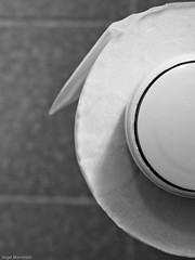
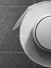
First up then is this picture of a toilet roll holder - the one on the left is my original. My tutor felt that the picture would be improved if the surface of the paper were also in focus – fortunately I had a version with focus on that area (but limited focus on the holder) – so I combined the two to give the version on the right. I agree with his analysis and will be going with the reworked version. Kicking myself a little here – this is the sort of fine detail I need to keep more focussed on.
   
My second image was this one. Peter didn’t find it as interesting as the above, but acknowledged that it added to the set when taken as a whole.

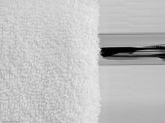
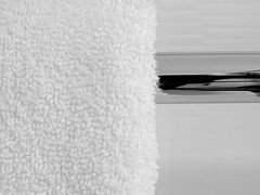
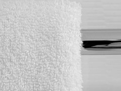
Third up was this one which I particularly like for the contrast in textures. My tutors suggestion was “To improve, trim a very small bit off the top so that you get rid of the top of the towel. This would also lift the rail slightly to bring it more on to the upper “third”.” My original version on the left as before. For the middle shot I followed Peter’s suggestion (almost – I retained the top of the towel) and for the rightmost shot I tried a crop to bring the composition into a classical ‘rule of thirds ‘ form, while removing the top of the towel. I feel this last treatment spoils the photo, with insufficient metal to balance the white of the towel. Overall I prefer the middle version and will go with that. It removes the slightly distracting  grey line along the top of my original, but still leaves the fluffy edge of the towel defined.
Hotel anywhere (3 of 12).jpg    
For the next two shots the comments were complimentary, although he felt I could perhaps have showed more of the Gideon’s Bible to provide more clue as to what it was. I’m not persuaded by this argument, as I think that making it too obviously a Gideon’s Bible would reduce its ambiguity. The Bible is quite a potent symbol, and I feel that if the shot were obviously a bible it might affect the balance of the set. In fact the comment has made me consider if it is appropriate to name the photos at all. On balance I believe it is because then a viewer has the opportunity to confirm what the object is if they really want to.
  
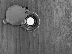
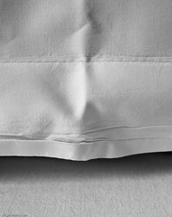
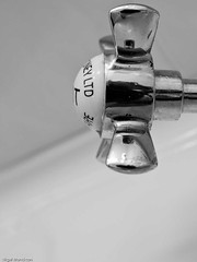
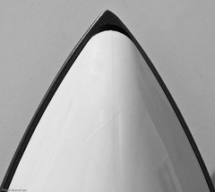
The next shot (the spyhole) was described as “for me one of the best shots in the assignment. Brilliant.” while he was comparatively unmoved by the pillow-case. Interestingly one of the comments I received on Flickr felt the pillow-case suggested a story. Perhaps one of the strengths of a series of semi-abstracts is that people can add their own meaning . This is emphasised by the final shot below – which Peter felt was more interesting because the ‘T’ of the hot tap was visible, while the person who liked the pillowcase shot felt the tap was more like an exercise in composition.
   
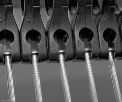
For Coat hangers (below) Peter felt I could have zoomed a little wider, or perhaps moved back slightly to incorporate more of the left hand hanger. It’s a legitimate comment but I am unsure – I have looked at other examples that I took and remain comfortable with this version largely, I think, because I would not want to significantly increase the gap between the left hand metal hanger and the edge of the photo.

Similarly in this photo below Peter feels a tighter or wider crop would have been better, rather than having the dryer cut by the frame, which he feels gives an untidy composition. Again this is a perfectly fair comment. However I have checked my files and I have three other versions of this shot – all with the hairdryer centred and slightly cropped top and bottom, which I remember thinking were unsatisfactory at the time of shooting. From my memory of the setting, I doubt a wider crop would have looked better – and while I have the option to crop smaller I think that this version has a nice balance.

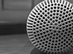
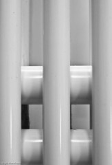
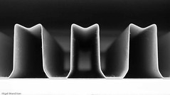
As with the second image above, Peter felt that there was little of interest for the viewer in this shot of radiator fins, but that it would contribute to the overall set. For me, it is the symmetry and the dust (not visible at this scale) that makes this interesting.

Peter described my final example as ”an excellent attempt in trying to create something from nothing.” which is a nice finale, as that was part of the original intent of the set.


Conclusion
Overall I was very pleased with this project. There are no ‘stand-out’ pictures in the set but they work together well – I have received positive comments on the set (see Flickr here) from a number of places. In the process of putting the shots together I have made use of much of the material in the course and as I have progressed the final edit they have come together to produce a set with real meaning for me.
I’ll finish with a quote from my tutor: ”This time you have chosen an unusual subject, but you have handled it very well as usual and what appears to be mundane you have made interesting images from.”

Tuesday 28 December 2010

DPP1: Exercise 25: A web gallery

I have had a website for a couple of years at www.npmimages.com so this exercise is mildly artificial. I’ve checked with my tutor and, having looked at the site, he does not feel that I need to produce another gallery. Even so, I thought it was worth running through the key points of the exercise against my existing site.
First up is image size. The maximum size permitted is 800 pixels on the longest edge, but I chose not to go that large to reduce the likelihood of image theft. I would probably have to concede now that this is something of a conceit, but the site works well with the existing sizing so I shall be continuing with this size.
Why do I have a website? Largely it is to show off my skills as a photographer – I admit to a certain satisfaction if I see a pulse in visitors to the site when I change the content. Recently I have linked it to my personal blog so that they support each other. The blog is for my photo-a-day project while the website provides a more permanent home for my strongest images.
Quality of images – one area I need to strengthen is putting in a proper review process so that I ensure that the site displays the quality I would hope to be recognised for.
Layout. As the site is a template site the worst design excesses – flashing buttons, multiple fonts etc are difficult to implement even if I were so inclined. The navigation menus are inherently simple and the gallery designs are tried and tested. Some significant customisation is possible, but other than changing background/font colours to match my blog I have tended to stick with simplicity. I’m not sure this would continue to be adequate if I were a full time professional as, in those circumstances, I believe the design of the website would need to be more personalised. For example, Marc Rogoff’s website is as striking as his images, while Wolfgang Tillmans’ is apparently ‘undesigned’ – which seems highly unlikely - and results in the images being the only object of interest on the screen once you scroll past the navigation menu.
Another good example of design to suit the photographer is Julia Boggio Photography where the quirky intro page is a perfect fit for her style of photography and shows a very clear understanding of who her customers are.
Searchability is another area I need to improve – the photos on the site have a limited number of keywords – most have none beyond the heading.
A final issue, and one not included in the notes is integration with social media. My website itself does not have any obvious integration tools but my personal blog in particular has a number of share buttons, and every entry is published to my Facebook stream and to Twitter. The statistics show that these two acts alone are responsible for a significant portion of the traffic to my blog. I have also made sure that my website, my personal blog and my other learning blogs are easily accessible from this site and from each other.

Friday 24 December 2010

The Düsseldorf School of Photography

Have come across several references to the Dusseldorf School since beginning this course, the most recent – and most thought provoking being an article in Professional Photographer arguing that, as an industry, photography needs to be careful that the Dusseldorf School does not ‘kill it’.
So what is the Dusseldorf School? As usual there’s a Wiki article here which describes the school itself , with a link to the School’s website (in German only). In photographic terms the school is famous for Bernd and Hilla Becher, who developed a style of photography which could perhaps be described as ‘photo-entomology’ which appears to have started the New Objectivity Movement. They collected, for want of a better word, images of industrial structures – water towers and blast furnaces being the two most famous examples – which they took in very flat lighting and in very similar perspective and composition. The aim was to capture as objective an image as possible so that when displayed side-by-side the photos would allow viewers to compare the design and functionality of the individual buildings.
A number of their students have also become (very) famous photographers in their own right – Andreas Gursky, famous for very large . dead-pan, photos of large architectural spaces, Thomas Ruff who initially gained a reputation for his architecture and portrait photos, done in a dead-pan style, but has more recently been noted for a series of very large pixelated images originally lifted from the internet. There’s an interview here that will bear further reading when I get a chance.
Another photographer of the Dusseldorf School, Candida Hofer, also produces large scale images of interiors which could perhaps be described as sumptuous but soulless. Even her zoo animal photos give the impression that the animals themselves are stuffed.
The Professional Photographer article mentioned above (it’s not on the net so I can’t link to it) argues that because this movement has produced some exceedingly well paid photographers, many students of photography faced with looming deadlines resort to ‘objective’ photos of supermarket car-parks, give them pretentious German sounding names and hey presto – they’re part of a movement with artistic credentials – without actually having some any thinking for themselves. How much this is a fair assessment is largely conjecture for me.
I do know however, that it is difficult to avoid being influenced by this school of photography as it is widespread in ‘photos as art’ books, as opposed to the consumer photo mags. For example – my Assignment 5 – could perhaps be seen in this context, although in truth I had not heard of the Dusseldorf School, or New Objectivity, until I was almost at the point of submitting the project. Whether this is good or bad is really a matter for my tutors and the assessors – but I’m fairly certain that I was not attempting a totally objective view of the objects I photographed for that project –initially I was more concerned with developing something visually interesting from the relatively unpromising surroundings and over time this developed into a more personal reaction to the similarity of the locations.

Monday 20 December 2010

Final assignment sent off today

A good feeling. Apart from writing up exercise 25 and my previous 2 assignments that’s the coursework finished. I still have some book reviews to add to this blog and a few other bits and pieces that I’ve found useful on the way – and then it’s forward to the assessment.
Assignment photos here (Hotel Anywhere) if you want to see them

Sunday 12 December 2010

Assignment 4: Review of feedback

This module appear to have two threads running through it – the first is about developing the skills needed to manipulate digital images, the second to consider the ethical implications of these manipulations.
My original submission is here and for simplicity the end result is shown below:

Comments from Peter include:
“This one is going to be very difficult to comment on because it is so very well done. The book cover, as you say in your notes, is obviously fake because you have added later members of your family to the original image dressed in modern dress and in color.”
and:
“For me, the photograph itself could be tidied up around the edges to make it look as though it has been kept in perfect condition over the years. The fraying corners are a bit distracting although it does emphasize an old photograph. However I would crop off the border area of the image so that the viewers eye concentrates on the subjects themselves, then it would appear that you have an old photo on a modern book cover. As it is it looks like you have glued the image onto the cover. I would also add a bit more contrast to the color bits, particularly the mans blue shirt on the right so that it catches the eye of a potential buyer.”
Initially, in responding to these suggestions, I tried simply removing the soft white border from the photo, and retained the corner fixings, but it looked unconvincing, so in the end I went for a much more formal crop, as follows:

As I was unable to crop the layer which contained the photo I simply selected it using the rectangular selection tool, inverted the selection, and deleted everything on the layer within the inverted selection. This is a useful technique as the non-selected area is not deleted so you get a nice clean edge to the deletion.
On reflection I think I prefer this later version, and it will be included in my final assessment submission. My initial thought was that it lost the ‘family album’ feel I was attempting to produce, but it is certainly more like a book cover, so I’ll stick with this version.
I conclude that other than potential copyright issues there was little of ethical concern in this image – it is clearly a fake aligned with the title of the book – which was the intended result.
For the record – the small boy in blue is my son at age 5-6, the gentlemen in the blue shirt is my Dad, I’m in the red footie shirt, my granddad is 2nd left on the back row in the military uniform and my great-granddad is seated in the centre.

Friday 10 December 2010

Assignment 3: Review of Feedback

This module examines the introduction of personal interpretation post capture – in particular as the file is developed from the RAW (ORF in my case) file. The assignment requires a submission in black and white. For reasons explained in the submission I chose a series inspired by Ansel Adam’s Rose and Driftwood.
My original submission is here and the first of the six shots was this one:

“There is lovely detail and texture in the rose and the image is very sharp. However the top right hand corner of the frame needs toning down to show a bit more detail in the petals. Also you could afford a crop off the left hand side and a smaller crop off the bottom so that the rose fills the frame more.”
I agree with all of this but unfortunately the exposure is such that no more detail can be extracted from the file – all I succeed in doing is producing flat grey. I discussed this by e-mail and Peter advised leaving the top right corner as is, so the final version becomes:

The second image was a closer shot to start with:

“Again you have lovely detail in the rose and the sandstone texture is more attractive than the fabric and this time the rose fills more of the frame. As the previous shot it is a touch light in the top right hand corner, but this time it is more acceptable. From your notes you say you used ISO 100 so is noise reduction really necessary?”
The reason for the use of noise reduction was that I did some fairly hefty post processing on this image, (as noted in the submission) and I felt it was needed to improve the overall quality of the image. Again the exposure meant I did not have the option to produce significantly more detail in the top RHS, so after discussion with Peter I decided cropping more tightly on the right would improve the image overall, as follows:

I nailed the exposure more effectively in image 3 – perhaps because I moved away from a pure white rose to a peach one.

“The exposure on this one is very accurate and the subject is nicely placed within the frame so your technique is spot on. However, for me, the wire grid is a bad choice of background and gives the image an “untidy” look.”
I am in two minds about this one – the ‘untidiness’ was deliberate and if anything my concern is that it as not enough of a contrast – perhaps barbed or razor wire would have been better for this particular effect. I also struggled to get the luminosity of Adam’s Rose – perhaps because the tone of the rose was too similar to the colours in the background. On the other hand a number of friends and at least one fellow student thought this was the best of the six, so there is clearly a measure of personal taste in this discussion.
The 4th image uses the same rose, and again on a similar colour background, but is more attractive in my tutors view. I tend to agree and suspect this is at least partly because of the more effective contrast between the rose and the strong geometric pattern.

The actual comment reads: In contrast to the previous image this one is more pictorially attractive. The tiles form a very nice background and run diagonally across the frame which adds interest for the viewer. The rose itself is also nicely placed within the frame and again there are no burnt out high lights. Nice one.
For the 5th image I chose a red rose, which I contrasted with some pale wood shavings. This tonal separation allowed me some leeway to try to increase the apparent luminosity of the petals while still retaining some feel for their rich tones and textures.

“The shadows on this one are just a touch too dark, but the subject fills the frame nicely and the wood shavings make an attractive foreground.”
I have produced a version with the deepest shadows lifted slightly, which, as Peter suggests is an improvement on my original. I notice also that there is an important typo in my submission. The diagonal of the composition runs bottom left to top right not bottom right to top left as written. The final version for assessment is here:

And so to the last shot, and my overall favourite.The deep red of the rose and the dark blue of the denim in this one gave me the most opportunity to use the sliders to separate the rose from the background, and adjust its tonality and luminosity without significant impact on the rest of the image.

Peter agreed with my choice of favourite: “According to your notes this is your favourite image from the set and I whole heartedly agree with you. The rose is placed just a fraction too much to the right of the frame, but the texture and detail in this image are lovely. Even the highlights are not burnt out. The curvature of the denim from the right leads the viewers eye to the rose itself making an excellent composition. Brilliant.”
A good way to finish.
Conclusions
I had never tried serious black and white photography before so I found this assignment challenging to start with. I understood the theory of different coloured filters well enough, but had never attempted a practical application before. My overall aim was to capture something of the spirit of Rose and Driftwood – I’m not vain enough to think that I could replicate an Adams photo.
So, what have I learned:
  • black and white photos can take more ‘abuse‘ in post processing than colour photos before the quality begins to suffer. Not sure this is a good thing to take away, but it is undoubtedly useful knowledge.
  • the filter sliders in Lightroom provide a very powerful tool for separating tones, but it certainly helps if you think about the colours and the desired effect before you set up the photo.
  • stripping away the colour can provide an interesting interpretation of even the most colourful subjects.
  • black and white is worth further exploration.
Did I succeed in my aim? Well I think I did. The final photo is very different to Rose and Driftwood, but I do feel I have reproduced something of the luminosity of the rose which attracted me to the shot in the first place.
Footnote: I put my learning from this assignment to further use in Assignment 5 which is also Black and White – this is not something I would even have considered before starting this course.
As a further aside I was also quite pleased that I managed to avoid any ‘attention to detail’ points such as those highlighted in the previous two assignments.

Monday 22 November 2010

DPP1: Exercise 24: Sharpening for Print

I found this a particularly useful exercise as I had not had the opportunity to get to grips with the sharpening controls in Lightroom, which are significantly different from those found in Photoshop Elements (at least my rather antique version). As suggested I chose a portrait as the subject for the exercise:

This photo has a range of details that make it useful for this exercise – very fine patterning in the suite fabric and hair, coarse but high contrast patterns in the knitwear and areas which I will want to avoid sharpening in the face.

Lightroom has two kinds of sharpening: input and output. The input sharpening  works from a set of sliders which control amount, radius, fine detail masking (which controls the area affected)) and is the primary method for sharpening the photo. Output sharpening takes the photo and adds additional sharpening to prepare the photo for display on screen or in print. Given this variety I decided to extend the exercise to test 3 levels of input sharpening, and all three levels of output sharpening (low, standard and high).
I don’t propose to show all the variations in this entry as the differences were in some cases very subtle, and given the difference in viewing medium there is a limit to the value of displaying these differences. However they are all available on my Flickr site for interest. As a starting point here is the version with no sharpening – rather than show the whole picture I have taken a face detail to show the softness:

And here for comparison is a version with output sharpening set to high (I also tried this twice - once at the jpeg export stage and once at the print stage but cannot show the result here – in any case it was worse), and with input sharpening set to amount 125/Radius 2.5/Detail 15 with no masking. These are towards the top end of what the system offers.

While this extreme sharpening looks OK in the fabric, it is extremely unflattering to the face, makes the hair look very wiry and leaves ugly edges along the edge of the spectacle lens. If anything this is emphasised in the print version with the facial texture becoming quite unflattering.
This version has the Portrait (Wide Edges) preset enabled. This equates to amount 35/Radius 1.4/Detail 15/masking 60. There is little visible difference on-screen or in print between this and the unsharpened version. Output sharpening was low

I increased the amount to 100 and reduced the masking to 30 to give the following which is notably sharper but with a more flattering skin texture. Output sharpening was low. Overall this is my preferred output from the exercise and I will be using it as the starting point for sharpening of portraits in People and Place. Further reduction in the masking and increases in the amount started to produce noticeably less attractive results

This latter output is very close in print to the portrait preset version with high output sharpening (below) although it is visibly different at 100% on screen:

Conclusion
Obviously sharpening is unavoidable – this is (in most cases) a function of the manner in which a digital camera captures the image.
Lightroom provides some powerful but subtle tools for sharpening and ultimate quality is a matter of balancing the need to sharpen against the need to avoid unsightly artefacts. The masking tool is very helpful in this regard and as the penultimate shot above shows it can provide very useful fine control on skin and hair, compared with relying on preset sharpening.
My experience from elsewhere is that images used small on–screen can tolerate considerably more sharpening than larger images. For example, when the above image is viewed at 1:4 in Lightroom the heavily sharpened version looks simply crisp because the lower resolution on the screen removes the over-emphasised skin details.

Thursday 18 November 2010

Everything is illuminated– Wolfgang Tillmans

Back at the beginning of the course I decided that I would subscribe to the BJP – for a number of reasons – not the least of which was that I wanted to see photography different from the run of the mill stuff in the consumer camera mags. I would have to admit to being baffled by some of it, but this article ‘Everything is illuminated - British Journal of Photography’ from the July edition about a Wolfgang Tillmans exhibition struck a chord – especially the bit about his still life work.
He’s described the eyes as subversive because “they are free when used freely” – that is, they ascribe value to what’s seen in front of them, no matter how expensive or banal the subject. But although many of his still lifes show ostensibly everyday scenes, in fact many are staged, and if they’re not, they’ve acquired meaning for him over a long time before shooting.
Unfortunately it wasn’t practical to visit the exhibition – it was 350 miles away to start with – so I’ve been scratching round the web trying to find some more material by and about this guy. Unsurprisingly he has a website and it has links to a number of tour catalogues which have a range of his work, and some fairly detailed essays.
On the basis of the works presented his still life work is rather different from what I expected. They have a rather grungy feel to them, and it is rather left to the viewer to extract the beauty that he apparently sees in them. On the other hand his rather more formal Paper Drop photos are quite beautiful. There is some suggestion that there is a deeper meaning associated with the ability to see both sides of the photo at once, but I think I’ll need a little more research to decide whether I think that was his intent, or a subsequent reading of the images.
His portraits, which are largely of his friends vary from the touchingly intimate – you can almost feel the friendship being expressed in the photo – to the frankly disturbing – Man Pissing on a Chair for example. Again – it’s going to take a bit more thought and research on my part to work out what’s going on here.

Wednesday 17 November 2010

Assignment 1: Review of feedback

Somewhat belatedly my reactions and responses to the feedback I received from Assignment 1.
The assignment itself was a photo-shoot in Cockermouth during this year’s Georgian Fair. As I was expecting it to be busy a tripod was not really an option, and as I explain in the submission, I rapidly settled on a 50-200 telephoto as my primary lens. If you want to read the whole submission it’s available here on Scribd.
First up I was really pleased with the feedback – I was obviously nervous as this is the first time I've had any of my photography critically assessed in a meaningful way – but happily I needn’t have been. Peter made one comment on my chosen technique (I chose to use auto ISO – limited to ISO800) to the effect that he would have limited it to ISO400. At the time I went to ISO800 as the light was so poor and I was hand-holding at fairly long focal lengths.
Subsequently I went through the tolerance to noise exercise and concluded that I would be comfortable with ISO 800 for general use, but for critical use I would stay with ISO200 or lower.
On to the individual photos:

Peter acknowledged that this set the scene well and that my choice to frame diagonally added some interest to an otherwise static shot.

“This one is a pleasant enough portrait that I am sure your friend was very pleased with. You don’t say what the exposure was but a little fill in flash would help to add a touch of “sparkle”.”
Peter suggested fill flash at 2 stops under. I’m (still) kicking myself on this one as this was an early outing with my new E-3 which has a built in flash (unlike my previous E-1) so I could have done this – had I thought of it. It’s certainly a point to remember for People and Place – and for more general use.

“The colours on this one are lovely. The maroon coloured house goes very nicely with the bushes at the front. The composition is excellent but too improve clone out the wire that is just above the right hand corner of the gate and leading to the upper floor. Also clone out the door bell just below “39” and the intercom (if that’s what it is) between the door and the side gate. Then there will be no trace of modernity on the image.”
Not an issue I’d thought of at the time of submission – although obviously the kind of improvement discussed has been a key issue in the fourth section of the course. I did all the cloning suggested with the exception of the ‘intercom’ – which on closer inspection turned out to be a brass name-plaque – which seemed reasonably in keeping with the setting.
On a broader point I think that these mods are acceptable for this and exhibition use, but I would be a little uncomfortable if I thought these cleaned up shots were going to be used to represent Cockermouth as it is now.

“I like this one very much. As you say in your notes a wide enough aperture has been used to throw the background out of focus thus concentrating the viewers eye on the main subject. Excellent.”
Nothing to add really other than to say that I was pleased that I managed to get the shot without a trace of modern clothing anywhere (other than the glasses).

“Another good shot but again to capture the period you have chosen the clone tool should be used to improve.”
This time I lost a TV aerial and a genuine intercom, together with some phone cabling.

Again this is an excellent image with no trace of modernity whatsoever. The subject has been well caught and once more a relatively wide aperture has been used to make the subject stand out from the background. Another winner.
I guess you can begin to see why I was pleased – although on reflection I think this would have been improved by a wider aperture. I checked the original and it was shot at f8 – I think f4 would have provided better isolation from the background.

“Pictorially the club is cutting off a little of the jugglers face but I know this type of shot is not easy to execute. My advice would be to take several and select the best. Also a slightly slower shutter speed would emphasize more movement in the clubs.”
I find nothing to disagree with here. ‘Burst’ mode would certainly have given me more shots to choose from and since I included it in the collection to add some life I agree with the idea about the slower shutter-speed. I am a little uncomfortable about the impact of the green plastic mac on the overall setting as well – but it was raining, so macs or cagoules were to some degree inevitable.
                                
The right hand picture is the original submission which I include here to show the scale of the change and the end result.
“Another good candid shot but for me I would like to have seen more of the lady on the right hand side. I would be tempted to clone her out altogether so that the viewers eye is concentrated on the man making him the main subject of the image.”
I agreed, and completed this before I discovered that it was the technical requirement for Exercise 23. It is a much better shot with just one person. I was tempted to go the whole way and clone out the pub sign, but decided that it added some context.

“Again you have another good candid shot but the background is a bit too distracting. A wider aperture would have given you a shallower depth of field thus concentrating the viewers eye on the couple in the foreground.”
Agree entirely. Shot at f8 when f4 would have been a better choice.

As noted in the other similar shots I have cloned out some intrusive cabling and modern wall furniture, as suggested.

“As far as I can see this image is faultless. You have included the whole of the instrument and the subjects hat has not been cropped off. Again you have used a wide aperture to render the background out of focus thus making the musician stand out. Brilliant.”
This one was taken at f4, unlike the couple above.

“Absolutely fantastic! The colours on this one are lovely and the atmospheric smoke from the guns hides any distractions in the background. Adding local contrast to the subjects faces has worked very well and the red uniform adds further impact and interest. Well done.”
A nice way to finish. I think I can see how I could have done it a little better, but my coach has told me I’m not good at accepting praise so I’m going to shut up at this point.
Conclusions
A number of practical conclusions leap out:
  • be braver with shallow depth of field,
  • work on the use of fill-in flash,
  • think about shutter speeds more carefully when trying to capture ‘life’,
  • pay more attention to the fine detail when preparing the pictures for submission.
One of the key purposes of the preceding exercises was to establish the value of a structured workflow, and this has stuck with me. I no longer find myself without a charged battery (for camera or flash), I always have a spare memory card, my filing structure has improved (with the help of Lightroom) and I now have a more solid back-up strategy.
Finally, on a personal note, I didn’t tell Peter at the time but his feedback was just the confidence boost I needed relatively early in the course.

Assignment 2: Review of feedback

The purpose of module 2 seems to have been to develop an understanding of how digital cameras behave in differing conditions and the impact that has on the quality of the final image. I noted in my submission the assignment felt a little artificial and I emphasised the challenge in this by opting to shoot in hand-held fading light. For the types of photo I generally enjoy I would not normally have put myself in this position  – preferring a tripod or additional lighting instead of high ISO. However, on reflection there are clearly plenty of situations which do call for high ISOs, and in truth I enjoyed the challenge of this assignment sufficiently that I am slowly building a collection of very high ISO shots because I enjoy the resulting image quality.
The submission, in all its glory is here in Scribd.

This is a high dynamic range shot – without some post-processing I could not get detail in both the bridge support and the sky. If I had not chosen to shoot with a bare minimum of equipment I might have used flash to fill the shadow – as it was I took three shots at 1 stop intervals. The lowest of these was at 1/13s. As Peter notes: ‘at this low shutter speed you are risking camera shake which would make the image look unsharp’. I don’t disagree with this, but as it happens the real problem was that I could not get an accurate alignment of the cables between the three shots. so I was forced to use a different technique in PP.

“The contrast on the image is excellent which emphasizes the texture detail in the slates and stone work. On the downside pictorially the image is just a touch too tightly cropped and could do with a bit more “space” around it.”
Pleased with the comment on the contrast as it was the effect I was after. Not sure about the crop – I do like to fill the frame and the trees do give some context. I feel this is a matter of taste.

“A fairly straight forward shot but effective nevertheless..… This is a nice simple image”
Nothing to add really, except this was the one shot I had pre-planned and needed a bit of luck with the sunlight to achieve.
                                      
The original is on the right. I tried to address this comment - “To add more interest it would have been better if you could have arranged for the lights to be on in the upper rooms so that the hotel looks even more “inviting” to a potential client.”  - by using a Photoshop technique from Digital Photography Special Effects by Michael Freeman. I’m unconvinced by the technique in this instance (but see a better example later) although I fully agree with the suggestion. In this case I’ll be sticking with my original at assessment time.
By this stage in the evening I was already at ISO800 and was quite pleased with the noise control I was managing.

“For me this is the best image in the assignment. The use of a 4 sec. shutter speed has created a lovely blur to the water giving the effect of fast flowing and the Emboss filter in Photoshop has brought out texture detail in the rocks. I think you could afford to crop a little more off the base of the image, but nevertheless this is still a very striking shot. Well done.”
The version shown above has the additional cropping – I agree that the extra expanse of brown water added little to the original.
                 
Original on the right again.
“The exposure and technique are spot on, but you could afford to crop off some of the foreground hedge. Again if you could arrange for the lights to be on the upper floor it would add further interest, or try cropping off the upper floor so that you have a “letter box” style image.”
I felt cropping to a letterbox removed too much context so went with the room light suggestion using the same technique as above. this time it worked much better – although its not too obvious in these small versions. I also went with the crop of the hedge as it gives a more intimate feel.
                      
Original submission on the right –as you can see I cropped to a vertical format. Peter’s comment:“I prefer the shot that you started off with. The plant is nicely placed on the left hand third and as you say the stem is a little too bright. Try reducing the contrast on this area in Photoshop to see if it can be improved.”
I had no luck with the stem brightness – it is completely burned to white but I feel, as I said in the submission that it gives the impression of the stem being the light source. I feel that effect is lost a little in the larger version. I asked peter why he preferred the uncropped version and received the following reply: I preferred the uncropped version because the bright area was placed on the left hand third, but that's all. Photography (like paintings) is very subjective, but generally the "rule of thirds" is a good rule, but not written in stone. Please don't worry too much about it as your work is very good.”
I’m familiar with the rule of thirds and felt that might be the basis of the suggestion, however, in this instance, I’m going with my judgement – I don’t think the flower on the right of the uncropped version is strong enough to hold its own against all that blue space.

I shot this at ISO3200 as an experiment – Peter has counselled not exceeding ISO400 a couple of times now. however i surprised myself with this shot and his comment was: “considering the very high ISO the noise is virtually non existent and you are to be congratulated for achieving this.” I rather like the overall surreal effect that pushing things to the extreme has produced.
In the original the green background area (mid-left) was rather brighter – I’ve toned it down as per Peter’s suggestion.
Conclusions
I deliberately made this exercise somewhat more difficult for myself by adopting a bare minimum kit for the session, forcing me to push the limits of my technique to get good quality results. As a result of I have a much improved understanding of the circumstances in which I can ‘break the rules’ on ISO ratings in particular. It has also encouraged me to experiment at the edges of my cameras capability, and I have some interesting shots as a result.
The technique for inserting light into a darkened window is a handy one to have in the kitbag, although if it were a commercial shoot I would certainly be asking the landlord to put a few lights on. This coupled with the first assessment says to me that I need to think a little more carefully about some of the fine detail’s before pressing the send button on the assignment.