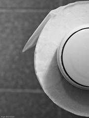
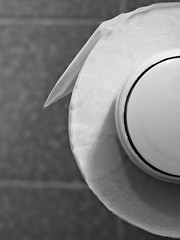
First up then is this picture of a toilet roll holder - the one on the left is my original. My tutor felt that the picture would be improved if the surface of the paper were also in focus – fortunately I had a version with focus on that area (but limited focus on the holder) – so I combined the two to give the version on the right. I agree with his analysis and will be going with the reworked version. Kicking myself a little here – this is the sort of fine detail I need to keep more focussed on.
My second image was this one. Peter didn’t find it as interesting as the above, but acknowledged that it added to the set when taken as a whole.
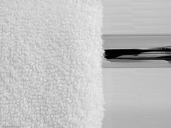
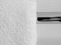
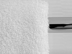
Third up was this one which I particularly like for the contrast in textures. My tutors suggestion was “To improve, trim a very small bit off the top so that you get rid of the top of the towel. This would also lift the rail slightly to bring it more on to the upper “third”.” My original version on the left as before. For the middle shot I followed Peter’s suggestion (almost – I retained the top of the towel) and for the rightmost shot I tried a crop to bring the composition into a classical ‘rule of thirds ‘ form, while removing the top of the towel. I feel this last treatment spoils the photo, with insufficient metal to balance the white of the towel. Overall I prefer the middle version and will go with that. It removes the slightly distracting grey line along the top of my original, but still leaves the fluffy edge of the towel defined.
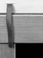
For the next two shots the comments were complimentary, although he felt I could perhaps have showed more of the Gideon’s Bible to provide more clue as to what it was. I’m not persuaded by this argument, as I think that making it too obviously a Gideon’s Bible would reduce its ambiguity. The Bible is quite a potent symbol, and I feel that if the shot were obviously a bible it might affect the balance of the set. In fact the comment has made me consider if it is appropriate to name the photos at all. On balance I believe it is because then a viewer has the opportunity to confirm what the object is if they really want to.
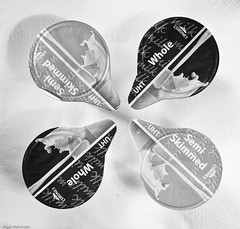
The next shot (the spyhole) was described as “for me one of the best shots in the assignment. Brilliant.” while he was comparatively unmoved by the pillow-case. Interestingly one of the comments I received on Flickr felt the pillow-case suggested a story. Perhaps one of the strengths of a series of semi-abstracts is that people can add their own meaning . This is emphasised by the final shot below – which Peter felt was more interesting because the ‘T’ of the hot tap was visible, while the person who liked the pillowcase shot felt the tap was more like an exercise in composition.
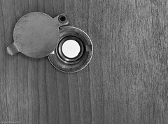
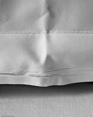
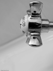
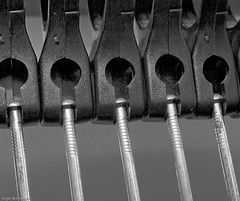
For Coat hangers (below) Peter felt I could have zoomed a little wider, or perhaps moved back slightly to incorporate more of the left hand hanger. It’s a legitimate comment but I am unsure – I have looked at other examples that I took and remain comfortable with this version largely, I think, because I would not want to significantly increase the gap between the left hand metal hanger and the edge of the photo.
Similarly in this photo below Peter feels a tighter or wider crop would have been better, rather than having the dryer cut by the frame, which he feels gives an untidy composition. Again this is a perfectly fair comment. However I have checked my files and I have three other versions of this shot – all with the hairdryer centred and slightly cropped top and bottom, which I remember thinking were unsatisfactory at the time of shooting. From my memory of the setting, I doubt a wider crop would have looked better – and while I have the option to crop smaller I think that this version has a nice balance.
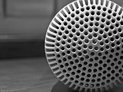
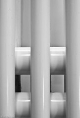
As with the second image above, Peter felt that there was little of interest for the viewer in this shot of radiator fins, but that it would contribute to the overall set. For me, it is the symmetry and the dust (not visible at this scale) that makes this interesting.
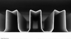
Peter described my final example as ”an excellent attempt in trying to create something from nothing.” which is a nice finale, as that was part of the original intent of the set.
Conclusion
Overall I was very pleased with this project. There are no ‘stand-out’ pictures in the set but they work together well – I have received positive comments on the set (see Flickr here) from a number of places. In the process of putting the shots together I have made use of much of the material in the course and as I have progressed the final edit they have come together to produce a set with real meaning for me.
I’ll finish with a quote from my tutor: ”This time you have chosen an unusual subject, but you have handled it very well as usual and what appears to be mundane you have made interesting images from.”


No comments:
Post a Comment