The submission, in all its glory is here in Scribd.
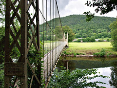
This is a high dynamic range shot – without some post-processing I could not get detail in both the bridge support and the sky. If I had not chosen to shoot with a bare minimum of equipment I might have used flash to fill the shadow – as it was I took three shots at 1 stop intervals. The lowest of these was at 1/13s. As Peter notes: ‘at this low shutter speed you are risking camera shake which would make the image look unsharp’. I don’t disagree with this, but as it happens the real problem was that I could not get an accurate alignment of the cables between the three shots. so I was forced to use a different technique in PP.
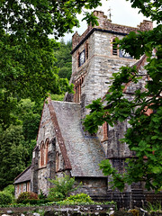
“The contrast on the image is excellent which emphasizes the texture detail in the slates and stone work. On the downside pictorially the image is just a touch too tightly cropped and could do with a bit more “space” around it.”
Pleased with the comment on the contrast as it was the effect I was after. Not sure about the crop – I do like to fill the frame and the trees do give some context. I feel this is a matter of taste.
“A fairly straight forward shot but effective nevertheless..… This is a nice simple image”
Nothing to add really, except this was the one shot I had pre-planned and needed a bit of luck with the sunlight to achieve.
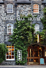

The original is on the right. I tried to address this comment - “To add more interest it would have been better if you could have arranged for the lights to be on in the upper rooms so that the hotel looks even more “inviting” to a potential client.” - by using a Photoshop technique from Digital Photography Special Effects by Michael Freeman. I’m unconvinced by the technique in this instance (but see a better example later) although I fully agree with the suggestion. In this case I’ll be sticking with my original at assessment time.
By this stage in the evening I was already at ISO800 and was quite pleased with the noise control I was managing.
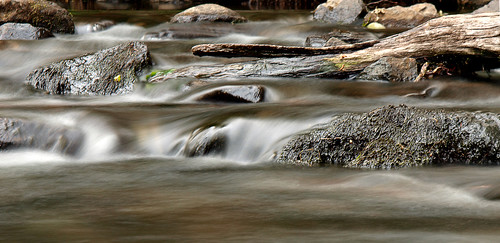
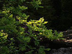
“For me this is the best image in the assignment. The use of a 4 sec. shutter speed has created a lovely blur to the water giving the effect of fast flowing and the Emboss filter in Photoshop has brought out texture detail in the rocks. I think you could afford to crop a little more off the base of the image, but nevertheless this is still a very striking shot. Well done.”
The version shown above has the additional cropping – I agree that the extra expanse of brown water added little to the original.
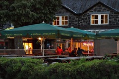
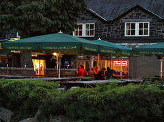
Original on the right again.
“The exposure and technique are spot on, but you could afford to crop off some of the foreground hedge. Again if you could arrange for the lights to be on the upper floor it would add further interest, or try cropping off the upper floor so that you have a “letter box” style image.”
I felt cropping to a letterbox removed too much context so went with the room light suggestion using the same technique as above. this time it worked much better – although its not too obvious in these small versions. I also went with the crop of the hedge as it gives a more intimate feel.
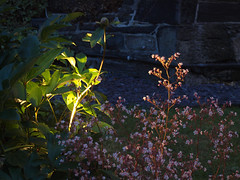
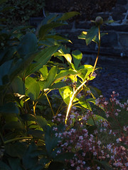
Original submission on the right –as you can see I cropped to a vertical format. Peter’s comment:“I prefer the shot that you started off with. The plant is nicely placed on the left hand third and as you say the stem is a little too bright. Try reducing the contrast on this area in Photoshop to see if it can be improved.”
I had no luck with the stem brightness – it is completely burned to white but I feel, as I said in the submission that it gives the impression of the stem being the light source. I feel that effect is lost a little in the larger version. I asked peter why he preferred the uncropped version and received the following reply: I preferred the uncropped version because the bright area was placed on the left hand third, but that's all. Photography (like paintings) is very subjective, but generally the "rule of thirds" is a good rule, but not written in stone. Please don't worry too much about it as your work is very good.”
I’m familiar with the rule of thirds and felt that might be the basis of the suggestion, however, in this instance, I’m going with my judgement – I don’t think the flower on the right of the uncropped version is strong enough to hold its own against all that blue space.
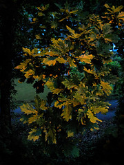
I shot this at ISO3200 as an experiment – Peter has counselled not exceeding ISO400 a couple of times now. however i surprised myself with this shot and his comment was: “considering the very high ISO the noise is virtually non existent and you are to be congratulated for achieving this.” I rather like the overall surreal effect that pushing things to the extreme has produced.
In the original the green background area (mid-left) was rather brighter – I’ve toned it down as per Peter’s suggestion.
Conclusions
I deliberately made this exercise somewhat more difficult for myself by adopting a bare minimum kit for the session, forcing me to push the limits of my technique to get good quality results. As a result of I have a much improved understanding of the circumstances in which I can ‘break the rules’ on ISO ratings in particular. It has also encouraged me to experiment at the edges of my cameras capability, and I have some interesting shots as a result.
The technique for inserting light into a darkened window is a handy one to have in the kitbag, although if it were a commercial shoot I would certainly be asking the landlord to put a few lights on. This coupled with the first assessment says to me that I need to think a little more carefully about some of the fine detail’s before pressing the send button on the assignment.


No comments:
Post a Comment